westf27
|
| posted on 18/3/09 at 09:08 AM |

|
|
vehicle signwriting
need to get my new van signwritten for business.Its a white (well it would be) and the question is what colours to use.I want it to look very up to
date,professional and a little future proof if poss.This site must have a wealth of artistic talent sadly I don't possess that.
If it helps I repair Domestic kitchen appliances and install the fitted appliances.
steve
[Edited on 18/3/2009 by westf27]
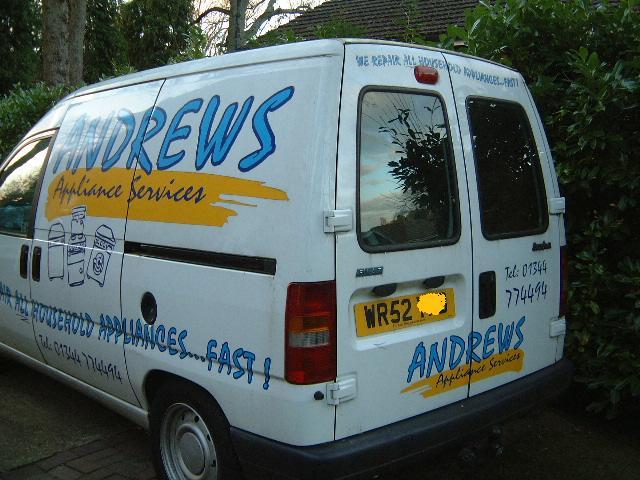
my previous van design now a few years old
 
Description
[Edited on 18/3/2009 by westf27]
555
|
|
|
|
|
thunderace
|
| posted on 18/3/09 at 09:51 AM |

|
|
how much work do you think you get from the signs on your van as a %???
(i have always wanted to know if its legal to have a rolling sigh in a van that moves ,as your eyes detects movement a lot better than stationary
objects .)
[Edited on 18/3/09 by thunderace]
|
|
|
Keith Weiland
|
| posted on 18/3/09 at 10:01 AM |

|
|
The one you have looks OK to me, if you keep it the same then people will recognise it more readily.
|
|
|
westf27
|
| posted on 18/3/09 at 10:27 AM |

|
|
Advertising is a black art.The van supports the advertising we do,creates an image and provides assurance for the customer.The revenue it generates is
not easy to assess but I often see people scribbling the phone no. often make comments on the layout.Some query the fact that they see the van so
often i must have a few of them.To me its an advert that lasts 3/4 years and for five hundred quid its cheap.
555
|
|
|
dhutch
|
| posted on 18/3/09 at 02:11 PM |

|
|
I'd agree with that. Its all about looking like a viable bussiness.
- Our builder was a local builder, and we go him in on recomendation from a lot of people. So that fact that his van just had numberplate-style
"Jo Blogs, Builder & Workman, Tel 01829 888888" or whatever, Didnt really matter. We knew him, and we knew he was good.
But for appliance servicing, you dont really research which is best, you go for one that looks good and just go with it. So the look is important. And
while you might mention it to a freind who might then look there first. It is all more on first impressions.
But to cut to chase, i would also suggest keeping it simular. Recognisable against the origanal anyway.
- The old signing doesnt look to bad. But the man thing i would say its just a little bit childish in a way that sot of says 'ms wordart'
if people know what i mean. Partiularly the wavy text, espcially where it down the side of the van on the pannal crease.
So. I would keep the 'logo' the same. But change the font of the low text and phone number to somthing a little more plain, and cut the
wave. Somthing like Helvetica or Comic Sans.
If you wanted to do anything at all to the logo, it would be a minor tweak to the shade of colour used. But you would have experiment with that in
photoshop or somthing.
Daniel
|
|
|
dhutch
|
| posted on 18/3/09 at 10:47 PM |

|
|
Also, it might not be any interest to you at all, but somone from another forum i run operates a vinal cut signage bussiness, and while ive never used
there services i cna only presume there competant.
Advertise on ebay, and also have a small website. Although there about to have that redone apprently.
http://cgi.ebay.co.uk/ws/eBayISAPI.dll?ViewItem&item=280314221307
Daniel
|
|
|


