I have processed one of my photos in 4 different ways.
Which do you prefer?
Image 1
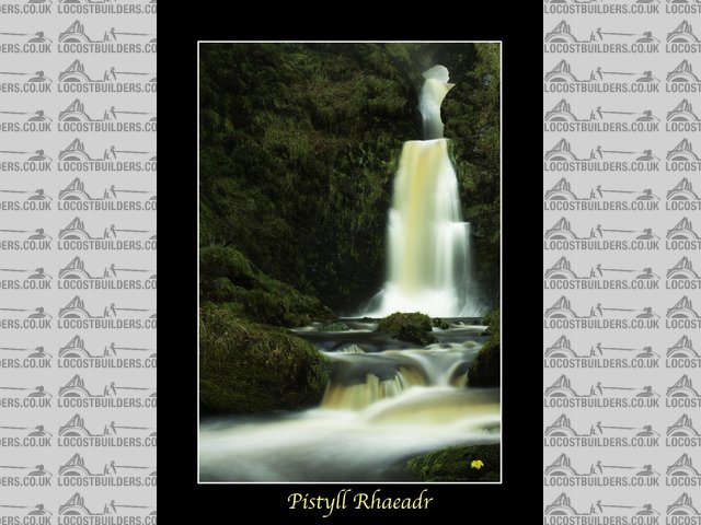
Description
Image 2

2
Image 3

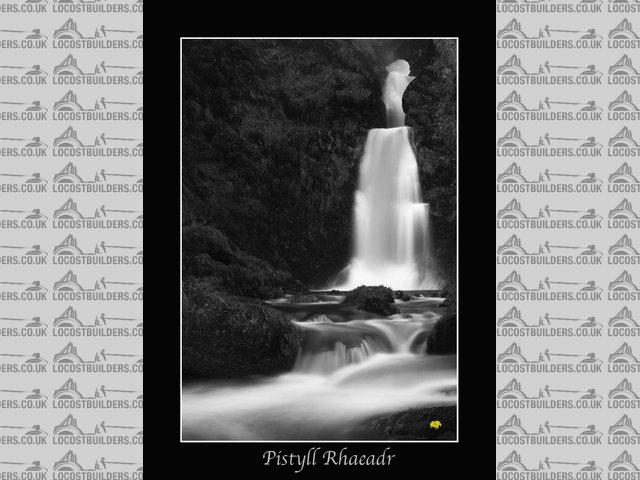
3
Image 4

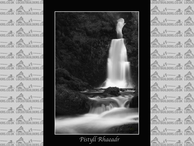
4
Cheers
Col

Guys,
I have processed one of my photos in 4 different ways.
Which do you prefer?
Image 1


Description
Image 2


2
Image 3


3
Image 4


4
Cheers
Col
No. 2
Personally I think the leaf looks a bit out of place. Like the monochrome though.
Not sure about the mono effect due to the lack of tones appears to have lost some detail in the foliage if that makes sense. Have you thought about a mixture of mono and colour
No 2.
Brings back childhood memories memories of holidays in Llanrhaeadr and climbing to the top of that waterfall!
1.... dont know why, it just looks good
Andi
NO1
as the water is that colour and the leaves on the fore ground foliage stand out a little more.
Like the little splash of colour bottom right
agriv8
[Edited on 29/11/11 by Agriv8]
Either one in colour, can't say the leaf makes any difference it just looks like your watermark (although it is a touch bright)
No 1 then No2, I thought 3&4 looked a bit "lord of the rings"ish
I'm not a fan of long exposure pictures of waterfalls as they're all a bit too "arty" for me and been done before. I've voted No1, given it's a bit arty, then the leaf adds a bit of intrigue. It just looks like some sort of trademark in No3.
I really don't like the leaf - too distracting and in years to come I think you'll get sick of the 'mark' in the bottom corner.
Nice photo's tho and I'd probably go 2,4,1,3
Prefer 4 myself