turbodisplay
|
| posted on 25/5/10 at 06:17 PM |

|
|
Any sugestions on this dash?
Hi,
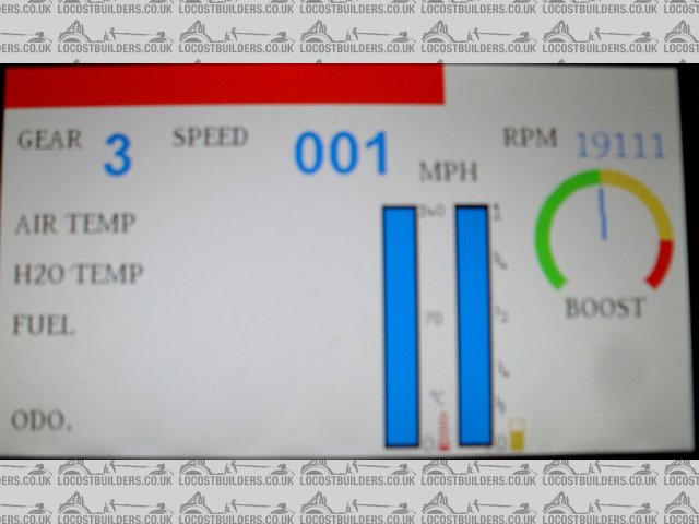
Currently comming close to finishing dash no.2, using an LCD screen to display the data, so have more freedom with the posisitionn of the displays.
Here is what I have done so far, the boost gauge is optional. Looking to include a/f ratio as well (again optional).
There will be 8 symbols on the side on the lcd (indicators, main beam etc.).
Any thoughts/ ideas?
 
lcddash
Thanks
Darren
|
NOTE:This user is registered as a LocostBuilders trader and may offer commercial services to other users
|
|
|
tomprescott
|
| posted on 25/5/10 at 06:30 PM |

|
|
Just my opinion but I think it looks a bit too confused as everything has similar focus, I prever to see rpm and speed much larger than peripheral
info like fuel, odometer, gear etc.
A bird in the hand....
|
|
|
flak monkey
|
| posted on 25/5/10 at 06:38 PM |

|
|
Simpler is most definately better when it comes to digital dashes in my opinion.
I have one of these:

The display is super clear. The bottom 5 parameters are user configurable to show whatever you like. The bargraph RPM is great with the shift lights
above it - very quick to see at a glance. I have mine showing Water temp, AFR, trip distance, oil pressure and oil temp. Then the lights along each
side can be configured to show alarms for any monitored input going high or low....
Just my 2p worth....
Sera
http://www.motosera.com
|
|
|
turbodisplay
|
| posted on 25/5/10 at 06:39 PM |

|
|
I'm looking to make the font for the speed larger. I originally tried having the temp and fuel below the boost gauge, found it was a bit too
small.
I could make the graphs a bit smaller and keep them vertical I guess.
The screen is 11cm accross the diagonal.
Thanks
Darren
|
NOTE:This user is registered as a LocostBuilders trader and may offer commercial services to other users
|
turbodisplay
|
| posted on 25/5/10 at 06:42 PM |

|
|
Also the top bar is for rpm, changes size / colour accoring to rpm value.
Thanks
Darren
|
NOTE:This user is registered as a LocostBuilders trader and may offer commercial services to other users
|
JF
|
| posted on 25/5/10 at 09:20 PM |

|
|
Don't know how you plan to offer this dash (if at all). But personally I'd like the option to personalise it. I'd say use the
flexibility given by the LCD to let the user change the style, colors. Preferably even the size and location of the 'dials'. And maybe af
few user defined inputs?
Like personally I wouldn't want a bright white screen in my car. It would drive me nuts, certainly in the dark. So I'd prefer a dark
(black) background. And font colors to match the rest of the car.
I'd want speed and RPM clearly represented. And wouldn't mind to have to have a second look for fuel and temp. As long as there are
warning lights if they get out of bounds.
|
|
|
franky
|
| posted on 25/5/10 at 09:29 PM |

|
|
can you not make them with an analogue tacho like the stack stuff?
|
|
|
Madinventions
|
| posted on 25/5/10 at 09:51 PM |

|
|
What type of LCD are you using? Hitachi and Sharp do some really nice transflective ones now and from my experiments, you really need a sunligt
readable one to stand any chance of seeing it in daylight.
+1 for the comments above: A dark background will give nice high contrast and larger dials let you spot things at a glance.
Ed.
Mojo build diary: http://www.madinventions.co.uk
Solo music project: Syrrenfor http://www.reverbnation.com/syrrenfor
View my band website:
http://www.shadowlight.org.uk
http://www.eastangliankitcars.co.uk/
|
|
|
turbodisplay
|
| posted on 25/5/10 at 10:07 PM |

|
|
Thanks for the input.
I`ve looked at transflective and tried them out. The reflective ratio is about 3% so tend to hard to read in brighnt sunlight. An anti reflective
coating, with bright backlight works better.
I have the ability to switch colours of the background, text etc.
I think an analogue tacho might not refresh quick enought to look good/ be useful.
Thanks
Darren
|
NOTE:This user is registered as a LocostBuilders trader and may offer commercial services to other users
|
franky
|
| posted on 25/5/10 at 10:28 PM |

|
|
they're used in 90% of race cars as they're easier to read.... Like this..
http://atlasteam.gr/eshop/catalog/popup_image.php?pID=7074&invis=0
|
|
|
turbodisplay
|
| posted on 25/5/10 at 10:39 PM |

|
|
I just realise you ment an analouge tacho seperate to the lcd, not implimented in the lcd itself.
Still looking into analogue, problem is that at the moment there are a few design issues need sorting before it is economically viable.
Thanks
Darren
|
NOTE:This user is registered as a LocostBuilders trader and may offer commercial services to other users
|
RazMan
|
| posted on 25/5/10 at 10:58 PM |

|
|
As already said, a totally digital display is a nightmare to read when driving, and analogue rev counter is far easier as you don't need to read
a number to realise you are approaching the redline - just a nano second to see the position of a needle. Colour change is pretty good - red for
overheating, low oil pressure etc and green for normal range.
I have an Evodash which has a digital speedo and analogue rev counter ranging from blue to yellow to red - very easy to see in a flash.
I have to say that your design has rather too much information in the wrong sizes IMO. Priority has to be Speed & Revs, with other info taking
secondary importance, some possibly even being invoked by a menu button to keep the display less busy and more informative.
Cheers,
Raz
When thinking outside the box doesn't work any more, it's time to build a new box
|
|
|
02GF74
|
| posted on 26/5/10 at 07:23 AM |

|
|
quote:
Originally posted by RazMan
As already said, a totally digital display is a nightmare to read when driving, and analogue rev counter is far easier as you don't need to read
a number to realise you are approaching the redline - just a nano second to see the position of a needle. Colour change is pretty good - red for
overheating, low oil pressure etc and green for normal range.
I have an Evodash which has a digital speedo and analogue rev counter ranging from blue to yellow to red - very easy to see in a flash.
I have to say that your design has rather too much information in the wrong sizes IMO. Priority has to be Speed & Revs, with other info taking
secondary importance, some possibly even being invoked by a menu button to keep the display less busy and more informative.
yes, 100% agreement with Mr R.,
humans have evolved to process analogue infor far baetter then digital
simply because thye have been recognises dinosaur shaped objects far longer then writing and numbers.
As ^^^ says, a quick glance to note pointer position is far quicker to digest than to read a number.
|
|
|


