Winston Todge
|
| posted on 16/3/06 at 06:59 PM |

|
|
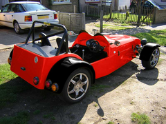
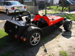
How's the VortX colour?
A little worried about how the car is gonna look when I'm done, so I borrowed a couple of pics from Ian and Andy and fiddled with them...
A little inspiration from Paul's site too...  http://vortx.chockymonster.co.uk/content/view/15/34/ http://vortx.chockymonster.co.uk/content/view/15/34/


I reckon it'll look okay... ? I suppose that's all that matters really.
Anyone else got similar types of colour schemes on their cars?
Chris... 
|
|
|
|
|
MikeR
|
| posted on 16/3/06 at 07:15 PM |

|
|
i'm hoping to make mine red down the plastic in the car (ie scuttle, bonnet, nose and rear panel with ali sides (unless i can find a way of
getting red cheaply) and black wheel arches.
|
|
|
smart51
|
| posted on 16/3/06 at 07:18 PM |

|
|
I thought about two tone myself. It looks good with that shade of red. Gel coat often comes out more orange than that.
|
|
|
Winston Todge
|
| posted on 16/3/06 at 07:23 PM |

|
|
Good point bud.
Quite pleased with the colour to be honest...

Chris.
|
|
|
Krismc
|
| posted on 16/3/06 at 07:54 PM |

|
|
well i like that red its very nice!
i wasnt that bothered about colour really just the car its self- i havent touched my bodywork yet if ya want orange LOL
Built, Ivaed, Drove and now Sold - 2011 MNR VORTX RT+ 2000cc Zetec on R1 Throttle boddies.
|
|
|
chockymonster
|
| posted on 16/3/06 at 10:48 PM |

|
|
Chris,
did you de-saturate the top picture? It looks a bit dark?
You may get more luck putting a white layer over the desaturated layer. Then you can play with the levels abit.
Which red did you go for?
Paul
|
|
|
Winston Todge
|
| posted on 16/3/06 at 11:54 PM |

|
|
Hey chocky.
Yeah I desaturated then fiddled with the colour balance to get the colour that approximated to traffic red (RAL).
I didn't put a white layer over the desaturation though.
You use Photoshop a bit? How you learn about it? Job? Or fiddling?
Chris.
|
|
|
chockymonster
|
| posted on 17/3/06 at 12:35 AM |

|
|
Photoshop is a bit of a mix really. I do a fair bit of web design as a hobby and it's a necessity.
Closest approximation I can get to traffic red is #d20b00.
What mode are you using for the layer? some colours don't respond well and changing the mode of the layer often helps.
 
Rescued attachment trafficred.jpg
|
|
|
chockymonster
|
| posted on 17/3/06 at 12:53 AM |

|
|
if I can offer any pointers then please ask, just don't ask mechanical stuff cos I'm pretty clueless about that 
I found changing the black layer to soft light makes it look a lot better.
 
Rescued attachment black-red--bonnet.jpg
|
|
|
Winston Todge
|
| posted on 17/3/06 at 12:55 AM |

|
|
That looks much more accurate chocky!
I'm using default 8bit RGB. What you using?
I've got the tub in black and everything else in traffic red. Seems a good approximation the #D20B00...
We'll just have to see how the colours turn out. I am going to put two black lines down the middle of the car too, to break up the lines a
little.
Cheers all,
Chris.
|
|
|
Winston Todge
|
| posted on 17/3/06 at 12:57 AM |

|
|
That second piccie looks stunning!
Good effort!
I'll have to play a little more me thinks... 
Chris.
|
|
|
Winston Todge
|
| posted on 17/3/06 at 01:00 AM |

|
|
Do you reckon you could reproduce the same piccie with a black tub and Traffic Red arches, cone, bonnet and scuttle? I just don't seem to be
able to get the same results...
Is Ian's car as easy to modify in the colour department, being all black?
Cheers bud,
Chris.
[Edited on 17-3-06 by Winston Todge]
|
|
|
chockymonster
|
| posted on 17/3/06 at 01:57 AM |

|
|
Once the colour is desaturated it shouldn't matter. I can't find the original to have a play with but if you mail me over your .psd file
then I'll have a go.
|
|
|
rjbrookes
|
| posted on 19/3/06 at 07:40 PM |

|
|
quote:
Originally posted by chockymonster
Photoshop is a bit of a mix really. I do a fair bit of web design as a hobby and it's a necessity.
Closest approximation I can get to traffic red is #d20b00.
What mode are you using for the layer? some colours don't respond well and changing the mode of the layer often helps.
that's exactly what mine will look like, with black (caterham) wheels...(your photoshop attempt was better than mine!)
thanks
Russ
|
|
|
Winston Todge
|
| posted on 19/3/06 at 07:51 PM |

|
|
Hey Russ.
Yeah, I'm still wondering if the black arches and everything else red would have looked better...
Still, we'll see and compare them once they're both done! 
Chris.
|
|
|
chockymonster
|
| posted on 22/3/06 at 03:19 AM |

|
|
Chris,
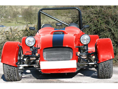
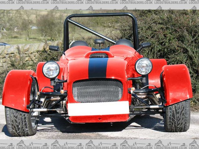
only one stripe but you get the idea.
Sorry it's a bit rough but perspective has never been a strong point!!
 
Rescued attachment chris-stripe.jpg
|
|
|
Winston Todge
|
| posted on 22/3/06 at 05:55 PM |

|
|
Thanks again Paul.
Should be making an appearance on the website in the not too distant future! 
Chris.
|
|
|
MikeR
|
| posted on 22/3/06 at 06:07 PM |

|
|
"bit rough" ........ pah, looks blooming fantastic compared to what i can do!
|
|
|
Winston Todge
|
| posted on 22/3/06 at 09:03 PM |

|
|
Ta for the picture Paul!
Now here...
www.mnrvortxr1.co.uk
|
|
|


