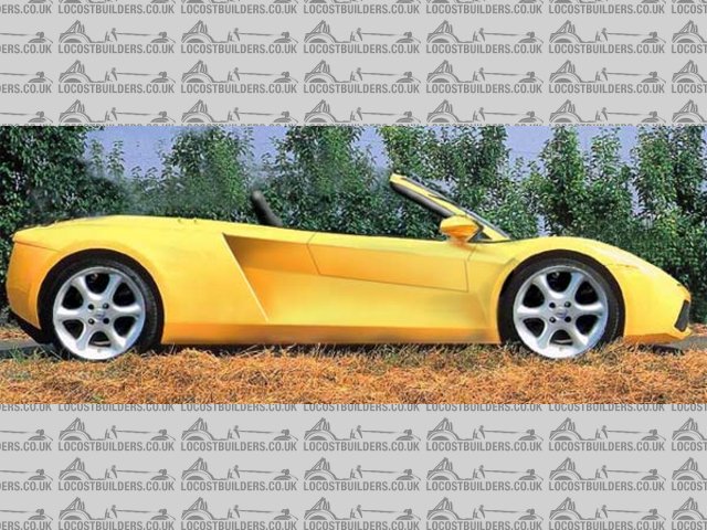
Opinions on my new Middy bodywork please
sgraber - 6/8/03 at 12:56 AM
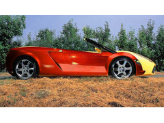
I have been busy building my mid-engine chassis and am pretty well along. You can look over in the mid-engine section or my website for details.... In
any case, this request for opinion is bodywork related.
I happen to think that the 'Brits (suppose that's most of members of this forum) have much better eye for automotive design than us
'Yanks... and so I offer up my design for your critique. It's strikingly similar to the new Gallardo. But I swear that my original design
was completed long before I saw that car! In any case, take a look if you wish and critique away. Remember that not all criticism needs to be
negative!
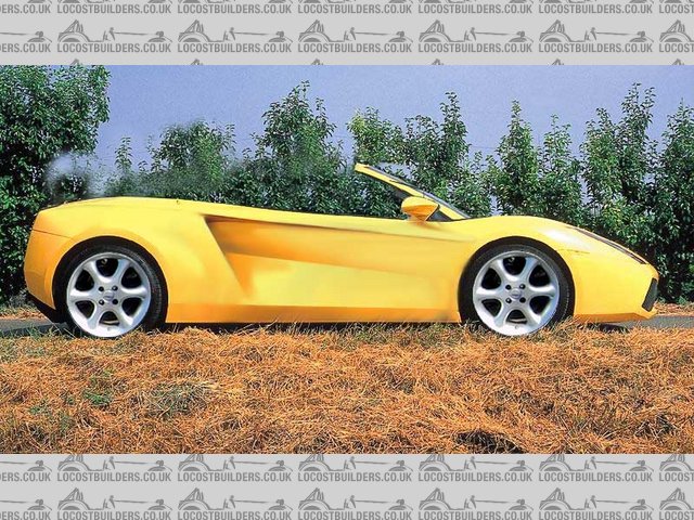
Rescued attachment Bala-from-Gallardo.jpg
sgraber - 6/8/03 at 12:57 AM
Here is a side view of the original la Bala overlayed on the new design.
[Edited on 8/6/03 by sgraber]
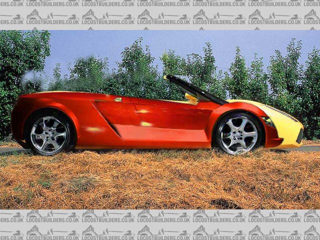
Rescued attachment Bala-over-Gallardo.jpg
Metal Hippy - 6/8/03 at 01:01 AM
I have to admit, it's a nice looking machine from that view...
Nice sweeping lines...
I shall wander to your site and take a look what's there...
Good work.
blueshift - 6/8/03 at 02:40 AM
That's very nice, in my apparently valid opinion as a Brit.
The main body top curve seems a little low around where it meets the windscreen.. it just looks a little sunken to me, the curve down from the front
wheel arch a little steep or long.
If it were mine I'd probably smooth that out / raise it up a bit.. but it could just be an angle thing, or just my brain.
very nice though. almost makes me want to go mid-engine 
pbura - 6/8/03 at 03:46 AM
I really like your original design. It looks like a crazy little desert rat, but is also upscale at the same time.
How about splitting the difference and elongating the nose somewhat, but keeping the raised fenders? Sort of along the lines of a late 60s Can Am
Lola but contemporary?
My thinking is that it would make the car look a bit more menacing (if that's what you have in mind) but still unique.
New or old versions, your design work has been outstanding.
Pete
(a tasteless American) 
sgraber - 6/8/03 at 04:28 AM
I reworked the design some more tonite and this is what I came up with. Shortened nose among other things. I apologize for the size of the images...
I will upload smaller ones next time...
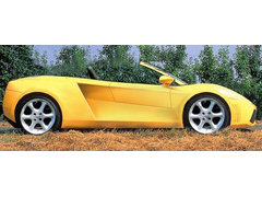
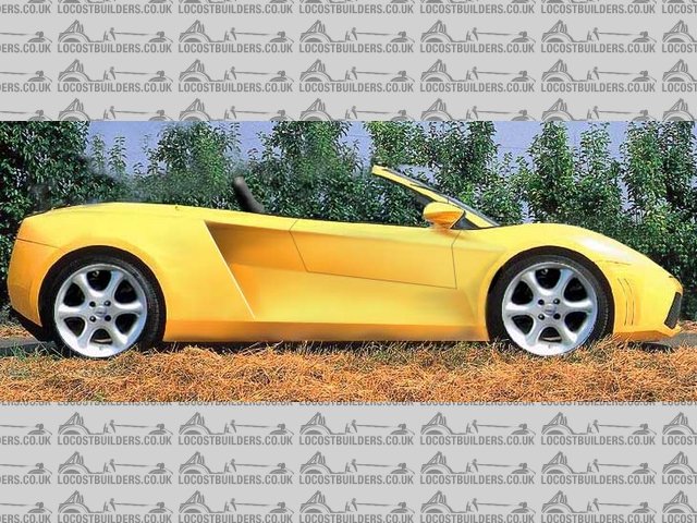
Rescued attachment Bala---Gallardo-1.jpg
Metal Hippy - 6/8/03 at 07:00 AM
That's good, a nice compromise...
It matches the car better perhaps because of the short overhang at the back..
It was nice before, but this one's better.
theconrodkid - 6/8/03 at 07:31 AM
i have to admit i agree with the hippy ,it do look good in version 3
Jumpy Guy - 6/8/03 at 07:39 AM
I think that version 2 looks better, not that fond of the 'snub nose' look...
IMHO, version 3 looks a bit 'kit car' , which I know is a bit rich on this forum, version 2 seems better balanced..
but, either way, top result! 
Simon - 6/8/03 at 08:30 AM
Well, of the two people in the office (me and colleague) who've seen it, so far approval is 100%.
Can't be bad.
ATB
Simon
ChrisW - 6/8/03 at 08:39 AM
I like the top one best. Where can I get one? 
Chris
ned - 6/8/03 at 08:43 AM
i like the top one, longer nose yellow version. something almost like the new lamborghini about it in a way (in my mind!) only thing i was unsure of
was how the wing mirrors mount, minor detail, great looking design...
Ned.
ceebmoj - 6/8/03 at 09:10 AM
[Edited on 6/8/03 by ceebmoj]
Peteff - 6/8/03 at 09:17 AM
It looks better with the longer front. Some attention round the screen pillars would be beneficial in my opinion as it looks like an afterthought at
the moment and much too spindly to actually work.
yours, Pete.
Spyderman - 6/8/03 at 09:43 AM
I think they all look good and if you were to make any of them would have a car to die for!
My personal choice would be a cross between the red one and the last one.
I prefer the front of the last one and the rear wheel arches of the red one. The small flair for rear arch gives the eye something to focus on. Less
blunt front makes it look faster and less gokart-like.
Whichever way you go it will look cool!
There was that positive enough?
Terry


andyjack - 6/8/03 at 12:44 PM
I prefer the second version. In my oppinion the 3rd version looks unbalanced almost like a cut and shut that has had the wrong front end fitted. I
think you need the long nose to balance out the sleek nature of the rear end.
blueshift - 6/8/03 at 01:03 PM
long nose version is better in my opinion.
sgraber - 6/8/03 at 01:33 PM
Thank You all very much! I probably should have made a poll out of this post, so I could tally the score! So much difference of opinion.  ay yay
yay....
I discovered, after measuring the already built chassis, that the nose will have to be the longer one to fit the radiator and still keep the bonnet
profile I am envisioning.
The windshield surround will indeed be thicker since there is a 2"x.095 roll bar that serves as the frame.
The car does (now) borrow styling cues from the Lambo. The #2 nose profile is off the Gallardo.
Next time I post, I will include other views. In the meantime, I have to finish the chassis.
Thanks again! Your input is encouraging!
Graber
ps- you can follow the build progress at my website. I am updating regularly now in the diary section.
MustangSix - 6/8/03 at 05:04 PM
It's a nice design, but I liked the long nose better and the little "gills" in the front seem a bit gratuitous, in my eye.
As far as Brit design sense, let us not forget a few shapes like the Daimler SP250......a car only a mother could love.
chrisg - 6/8/03 at 07:03 PM
I like the long nose version too
And my opinion is better than every one else's
So there
Cheers
Chris

stephen_gusterson - 6/8/03 at 07:41 PM
looks really good long, not so snub nosed.
atb
steve
Spyderman - 7/8/03 at 12:34 AM
quote:
Originally posted by MustangSix
It's a nice design, but I liked the long nose better and the little "gills" in the front seem a bit gratuitous, in my eye.
As far as Brit design sense, let us not forget a few shapes like the Daimler SP250......a car only a mother could love.
But let's not forget the Daimler was built for the American market! 
Whenever a designer gets it wrong they just say it's for the American market.
Rorty - 7/8/03 at 02:24 AM
Steve, definitely number 3, but minus the gills in front of the front wheel opening.
When will mine be ready for shipping? 
sgraber - 7/8/03 at 04:39 AM
I re-measured the existing chassis and found some disturbing items. Mainly that my original illustrations won't exactly fit the chassis I have
already built because the windshield is in the wrong location. Also the scale of the wheels came out to be 19" rims... 
The following illustration is a more realistic representaion of the design as fitted onto the existing frame. Notice that the entire shape is slimmer
and the rear quarter-flank is longer.
Do you all think that this is a step backwards in the evolution of the design? Please let me know if the original is more desireable. If the
overriding consensus is to keep the taller design, then I will need to make some major changes to the chassis...


sgraber - 7/8/03 at 04:44 AM
oops - must post image ....


Rescued attachment Bala-Gallardo-2-lowered.jpg
ned - 7/8/03 at 08:53 AM
nope, i'm afraid it still looks good.

Ned.
DaveFJ - 7/8/03 at 09:09 AM
you know that expression - about when an artist just doesn't know when to stop and ends up spoiling his work....
last picture is worst so far - first was best - IMNVHO
the extra distance in front of the rear wheel arch puts the whole design out and the snub nose is a no-no.
Generally it just looks - 'wrong' - now
whats wrong with 19" rims ?
Have you worked out any other views yet? would be interested in what you intend at the front and rear. I am a little dubious about what we can see of
the nose........
Whatever I probably know nothing - still a great design.. Good luck
[Edited on 7/8/03 by protofj]
andyd - 7/8/03 at 09:57 AM
I'd have to agree the first one is best. The longer nose gives it a more slippery line. It looks like it's going fast just sitting still.

That last one looks like the amount of material above the front wheel would be very little.
Will you be putting "real" doors on it? If so may I suggest that you put the outline on because that may change the whole look. Maybe for
the better maybe not but I think it'd be worth it to see (if you are going to have doors that is).
[Edited on 7/8/2003 by andyd]
Spyderman - 7/8/03 at 10:21 AM
Still looks great to me!
The door lines need revising though.
Sounds like you are getting into the same boggy ground as Alan did a while back.
Just do it, as it will differ from your drawings anyway! 
Terry


ProjectLMP - 7/8/03 at 02:10 PM
I have to give my vote to the first one, very nice, sort of a cross between a ferrari and lamborghini. The last one looks just a bit stretched. Maybe
if it was slighty taller it would look better.
MK9R - 7/8/03 at 02:32 PM
My two pence for what its worth, i think the longer nose would suit it better now that the screen has moved forward. STill looks impressive though
spy - 7/8/03 at 03:58 PM
the first one is a lovely design (although slighty wrong in the windscreen department). I think the last design looks too "flat" and could
do with being more curvy/meaty above the wheels
Just my own opinion.
mranlet - 7/8/03 at 05:18 PM
It sounds like you have to use your last one...
Might I suggest having the center of the windshield swoop to be farther forward? I like the position of the A-pillars, but I think it's the lack
of curve on your windshield that's hurting the design. If you can make it so that the A-pillars stay in the same place, but the windshield
continues the angle dictated by the nose cone, you will have a sleek looking winner.
BTW, only a baby wears a "bonnet", a car wears a "hood" 
-MR
mranlet - 7/8/03 at 05:25 PM
What if you did reverse jacknife doors too? Like, had them hinge at the top of the rear edge and rotate up? It would be awesome if the doors were
the whole side of car between the air intake and the front wheel wells. It looks like you could swing that with your frame...
-MR
sgraber - 7/8/03 at 08:37 PM
After another more accurate measuring session of the chassis and overlaying the resultant 3DS file on top of the posted illustrations I have
determined that all of the posted designs are buildable. Raise the windshield 4" and increase the rake by 6 degrees (to 42 degrees).
It's all systems go!
See my new avatar for new side intake to match the frame and reinstatement of the extended nose. If you'd like to see a larger version of this
final version, let me know and I'll post one up. However, I think I've used enough bandwidth on this topic.
Thanks for all your comments everyone! You've been a real help.
Now back to finishing the frame and getting it running....
 Graber
Bonnet/Hood - Tomato/Tomahto ... 

DaveFJ - 7/8/03 at 09:13 PM
Good luck
Can't wait to see the final result...
Spyderman - 8/8/03 at 12:11 PM
Steve,
Is this the sort of look you are after?
http://www.dynamic-performance.co.uk/flash.html
Terry


mranlet - 8/8/03 at 12:51 PM
You know, they really ought to make the bodywork at least a little aggressive... 
good find
-MR
DaveFJ - 8/8/03 at 01:00 PM
Nice one terry, the 'attack' is one gorgeous looking motor - and if the prices on the american site are anything to go by it could be a real
winner on cost to!

I want one.....
GO - 8/8/03 at 01:28 PM
Hey, they've nicked the Flintstones hood!!
stephen_gusterson - 8/8/03 at 04:39 PM
I can here it shouting at me from here!
It looks like and angry wasp!
atb
steve
BTW
It looks great
as does mr grabers car
quote:
Originally posted by mranlet
You know, they really ought to make the bodywork at least a little aggressive... 
good find
-MR
 It's strikingly similar to the new Gallardo. But I swear that my original design
was completed long before I saw that car! In any case, take a look if you wish and critique away. Remember that not all criticism needs to be
negative!


 ay yay
yay....