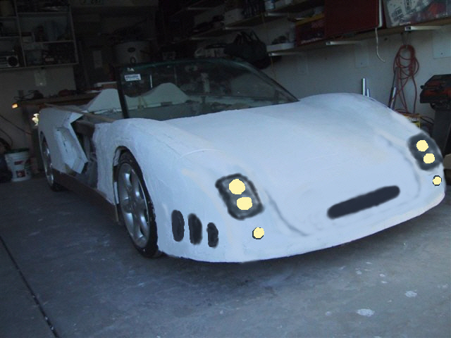
I had an idea that I could borrow a look from a supercar... I do like this, but it's not original is it...


Here is the original image. - If you would like to try your hand at designing a front end for my car, Go wild!


More images Here

Can some of you guys give me a hand designing a decent front end for La Bala?
I had an idea that I could borrow a look from a supercar... I do like this, but it's not original is it... 

Here is the original image. - If you would like to try your hand at designing a front end for my car, Go wild!

More images Here
make em pop up


I like the gills, and the center section , but the smaller holes in between look like poop, Try a smaller fog light, build into the area to break up
the open space, the headlights need to be the flip up kind ala' older style NSX lamps.
Of you can throw a couple of small missles down there and call yourself 007.
but I hate pop-ups... 
then maybee smaller round ones (like alan) only side by side.
Pop-ups suck, not only do they doubel as air brakes they are a PITA to fit and adjust.
The two small round lights look nice. However, my styling abilities are somewhat poorer than the average bit of roadkill so I won't attempt to
butcher the front of your car...
They are also prone to problems, one of my X19's, in wet weather, would pop up the right and drop the left on full beam and vice versa on dip, and on sides, they would slowly alternate - trick - eh
Projector headlamps with perspex covers are all the rage this year I've heard.


Rescued attachment Labalafront.jpg
Get rid of the little hole at the bottom pete.
[Edited on 20/10/04 by phelpsa]
I like the projector lights, but without the covers (like on the front of the Alfa Spyder?)
David
i agree david. anyone fancy a demonstrative pic? i know mine was shocking
and pete, was that design ultima inspired at all? bears a passing resemblence
tom
Bears a passing resemblance to lots of cars of the genre. There's not a lot more you can do without rebuilding all the front. You get rid of the
hole in your version Adam, I like it. It gives it a face. I've just looked at some Ultima pictures and they are more shark nosed with the grill
on the front, not really like my doodle.
[Edited on 20/10/04 by Peteff]
hmm - projectors without covers. With the long rake involved on the fender I think that that would create a very significant cutout. Not very
aerodynamic.
To be noted - the line cut into the fender is to be the centered height of the headlight according to my local department of motor vehicles inspection
requirements. No lower... 
Image deleted by owner
This version is more aerodynamic. I started to design it, and found it looked more and more like 3rd generation 94-03 Acura integra, the only
difference being that the headlamps are farther away from the front bumper and mounted on a slant from each other ( / ), mounted on the "wheel
humps", the yellow thing is a turn signal, again, like the integra, center grill is again 3rd gen integra after the 97 facelift
Image deleted by owner
After I posted the integra style front end, I started to think of other cars that might look good, here's the wrx lights on it
kind of looks porche-ish
[Edited on 21/10/04 by derf]
I like the Integra style round lights, that might be doable. I wonder what that yellow thing is though? The Subbie lights are not so hot.
Thanks for taking the time to help me out guys.

Graber
The yellow light is the integra style turn signal that wraps around the corner of the front bumper, it goes from front to side. Not sure if your state requires it, but I do know that NJ, NY, CA, MD, GA, SC, NC, CT, MA, and OH do require that the turn signal be viewable from the front and side. Thats why all USDM cars have the light on the front and side.
IMHO nice, thick (2" or so), louvered airvents across the hood is needed. The first pic is the best as well, but the smaller vents, indentions
flanking the grill are not needed. They clutter the look. The side gills are very nice. I think you should try to incorporate the side gill theme to
the hood.
--Chris