Fred W B
|
| posted on 6/9/07 at 08:12 AM |

|
|
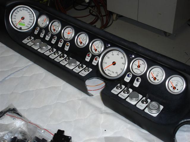
Bling GT40 Dash
Pinched this from gt40s.com. I think it looks great.
Owner says As Ive mentioned elsewhere on this forum, my view is that the biggest failing of any kit car is the dash. The car looks great, until you
look at the dash, and it looks half built. I feel they should look busy. When it came time to do mine I went for plenty of instruments and switches
in order to get an aircraft cockpit quality about it. Im using Smiths Telemetrix instruments, Rover toggles with MkII Jaguar blades, engine start
button from Demon Tweeks with audio control knobs to match for AC control, hazard and Bluetooth phone connection. Im using engraved plastic labels
for the switches. Theyll be silver to match the instrument bezels with the engraved names showing in black. Everyone thats seen it likes it
Cheers
Fred W B
 
gt 40 dash
[Edited on 6/9/07 by Fred W B]
You can do it quickly. You can do it cheap. You can do it right. Pick any two.
|
|
|
|
|
locoboy
|
| posted on 6/9/07 at 08:22 AM |

|
|
I like it 
In any other car i would have had to vote for OTT, but GT40 style its cool.
I can hear the pre flight switches being flicked already 
ATB
Locoboy
|
|
|
iank
|
| posted on 6/9/07 at 08:29 AM |

|
|
Bit OTT for my taste. Nice craftsmanship, but just far too many gauges and switches. The ergonomics don't look very good either.
--
Never argue with an idiot. They drag you down to their level, then beat you with experience.
Anonymous
|
|
|
David Jenkins
|
| posted on 6/9/07 at 08:31 AM |

|
|
OTT - you'd never be able to spot if something important was happening (unless you also had an aircraft-style hooter that shouted 'oil
pressure low' - 'oil pressure low' - 'oil pressure low' in times of crisis...).
More to the point - who managed to click on the 'non-option' below 'OK'? Early morning mouse problems? 
|
|
|
iank
|
| posted on 6/9/07 at 08:48 AM |

|
|
quote:
Originally posted by David Jenkins
OTT - you'd never be able to spot if something important was happening (unless you also had an aircraft-style hooter that shouted 'oil
pressure low' - 'oil pressure low' - 'oil pressure low' in times of crisis...).
More to the point - who managed to click on the 'non-option' below 'OK'? Early morning mouse problems? 
That would be me  
It was worse than OK, but I didn't think it deserved a completely OTT as it didn't reach these levels
linky
--
Never argue with an idiot. They drag you down to their level, then beat you with experience.
Anonymous
|
|
|
02GF74
|
| posted on 6/9/07 at 08:56 AM |

|
|
what a pointless waste of money and time and weight. *
the guy has no idea about Human Interfacing - if he wants to looks (& be distracted by something), why didn;t he fit a plasma TV in the dash?
It is all so wrong ; as DJ pointed out, you would have no idea if something went wrong.
The placement of dials is wrong too - dials with simialr pointers that point to the same place at normal should be next to each other - the human eye
is extremelty good in picking a differnet item in a group of similar items.
the only dials you need are speedo, rev counter, oil and wter gauages.
* I best not show my Land Rover dash panel then 
|
|
|
locoboy
|
| posted on 6/9/07 at 09:00 AM |

|
|
As fred says, its a 'look' he is going for, i think he has achieved it.
So long as he knows which dials and guages are the ones to keep an eye on then im sure he will notice anything untoward should anything happen
ATB
Locoboy
|
|
|
locoboy
|
| posted on 6/9/07 at 09:05 AM |

|
|
quote:
Originally posted by 02GF74
what a pointless waste of money and time and weight. *
the guy has no idea about Human Interfacing - if he wants to looks (& be distracted by something), why didn;t he fit a plasma TV in the dash?
It is all so wrong ; as DJ pointed out, you would have no idea if something went wrong.
The placement of dials is wrong too - dials with simialr pointers that point to the same place at normal should be next to each other - the human eye
is extremelty good in picking a differnet item in a group of similar items.
the only dials you need are speedo, rev counter, oil and wter gauages.
* I best not show my Land Rover dash panel then 
Tad harsh maybe?............. surely if ever there was a time for the old IMHO than this is it!
ATB
Locoboy
|
|
|
2b_pablo
|
| posted on 6/9/07 at 09:07 AM |

|
|
not my cup of tea at all Im afraid. Keep it simple is a great philosophy!
|
|
|
Fred W B
|
| posted on 6/9/07 at 09:07 AM |

|
|
Whats he got there?
10 gauges
Revs
Speed
Fuel gauge x 2
Oil pressure
Water temp
Clock
Amps
Oil Temp?
Fuel Pressure?
Cheers
Fred W B
You can do it quickly. You can do it cheap. You can do it right. Pick any two.
|
|
|
2b_pablo
|
| posted on 6/9/07 at 09:09 AM |

|
|
wiring was bad enough on my car for 3 gauges and a vapour imagine the back of that lot!
|
|
|
Dillinger1977
|
| posted on 6/9/07 at 09:13 AM |

|
|
completely disagree with him that a dash -should- look busy or the car looks unfinished. IMHO thats just confusing looking and looks tacky!
-Rog
|
|
|
nick205
|
| posted on 6/9/07 at 09:15 AM |

|
|
Definitely not to my taste although it does look well put together.
IMO simplicity is the key to a good and useable dash. Don't clutter it with stuff that doesn't really matter or tell you anything vital.
 
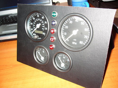
instrument inset panel
|
|
|
Peteff
|
| posted on 6/9/07 at 09:17 AM |

|
|
Years ago a mate of mine had a Moggy thou pickup with aeroplane gauges from various sources. He even had the altimeter and artificial horizon. That
was almost as overdone as the one in your picture I think.
yours, Pete
I went into the RSPCA office the other day. It was so small you could hardly swing a cat in there.
|
|
|
v8kid
|
| posted on 6/9/07 at 09:21 AM |

|
|
Got to take these things in context - for what it is I think its brill. Having said that the only instruments I have are an oil pressure gague, a rev
limiter warning light and a bike speedo - but the GT40 thing is a gendre in its own right and whats wrong with a bit of bling on a saturday night?
|
|
|
gezer
|
| posted on 6/9/07 at 09:22 AM |

|
|
not for me
I have to agree with those who say keep it simple and to the minimum,
that looks like a panel from a industrial complex,
also if the builder is over here would it pass SVA with those switches and knobs,
I'm to old to live and to young to die --- buggerit
|
|
|
3GEComponents
|
| posted on 6/9/07 at 09:28 AM |

|
|
Looking at the instruments, i take it that the car in question is turbocharged, and that the it's twin tanks aren't linked in any way?
Surely linking the tanks would have easier, and cheaper, than two fuel gauges.
Also the clock is a curious choice in that type of car?
|
|
|
ditchlewis
|
| posted on 6/9/07 at 09:35 AM |

|
|
      
totally OTT. very difficult to get the information you need from all those dials and a big distraction to the driving experience   
Ditch  
|
|
|
tks
|
| posted on 6/9/07 at 09:46 AM |

|
|
i like it, its the reason that its just because its new you need to know where to look at if you need to know certain information. saying that every
control need to work, else its useless.
also if you step in a cockpit of an airplane
you will feel the same, but after some lessons you will see that it makes sense.
sow i guess just more time needed to learn. also on the oil warning etc. you could easyly fit a buzzer for that.
Tks
The above comments are always meant to be from the above persons perspective.
|
|
|
DaveFJ
|
| posted on 6/9/07 at 09:54 AM |

|
|
I don't think the layout of the gauges is quite as bad as people have stated....
look at where the steering wheel goes.. to right you have the fuel together and is that a boost gauge?
to the left you have 2 pairs of smaller clocks seperated by a clock....
It's not to my taste but i think people are being a little harsh...
As for the switch gear....... that's another story altogether!
I didn't think toggle switches would get through SVA ?
Dave
"In Support of Help the Heroes" - Always
|
|
|
speedyxjs
|
| posted on 6/9/07 at 10:03 AM |

|
|
Too busy for my liking 
[Edited on 6-9-07 by speedyxjs]
How long can i resist the temptation to drop a V8 in?
|
|
|
2b_pablo
|
| posted on 6/9/07 at 10:05 AM |

|
|
maybe because a lot of us are track orientated it seems wierd. For a roadcar its probably fine but on track you need to know immedietly if something
goes iffy
|
|
|
davie h
|
| posted on 6/9/07 at 10:12 AM |

|
|
def not for me less is more if you know what i mean but hey each to their own i suppose
|
|
|
thebull
|
| posted on 6/9/07 at 11:36 AM |

|
|
gt 40 bling
far to ott
|
|
|
RK
|
| posted on 6/9/07 at 11:49 AM |

|
|
As long as he doesn't take his eyes off the road too much to check his gauges, who cares?
|
|
|


