Rescued attachment P1030077.JPG

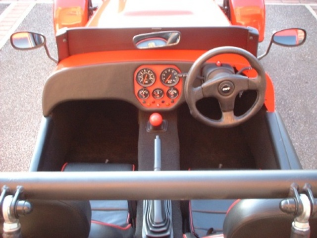
Just planning the layout of my dash before I start cutting holes.
Instruments are ETB (thanks Vince for the Tacho!). Warning lamps will be from SVC although I may use a Bright 6 module.
Which layout looks best (I'm leaning towards the first one)?
[Edited on 15/9/05 by nick205]
design 1
Rescued attachment P1030077.JPG
design 2
Rescued attachment P1030083.JPG
design 3
Rescued attachment P1030084.JPG
design 4
Rescued attachment P1030087.JPG
design 5
(bugger) design 5
Rescued attachment P1030088.JPG
design 6
Rescued attachment P1030091.JPG
love the first one
Number one's getting top marks 
(Followed by number 2 as a close second!)
How about as design 3, but the tell tales in a pyramid under the three dials - 4 across and 3 across underneath.
Just like mine was.
Pat...
number 1
looks great IMHO
did think about that Pat, but I have a batten glued along the bottom edge on the inside (for adding the radius) so I can't go any lower.
Have you got any pics of your dash Pat?
[Edited on 15/9/05 by nick205]
Hi,
I like "bugger" (5)
IMHO warning lights need to be high up, where they will catch your eye.
Swap the oil light over to the right, it needs to be very visable.
If your going to pad out & vinyl cover, don't have the gauges too close.
It's easier to cover a wider gap.
Looking good.
Paul G
I like number 1 a lot but i'd put the indicator lights in the middle either side of oil/ignition lights.
Like this?
I quite like it 
Rescued attachment P1030092.JPG
Design 1. Simple and symmetrical.
I like 2 mate indicators at top and each side just like my omega
5
Hi There
What about like this
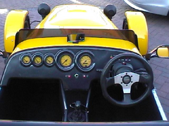
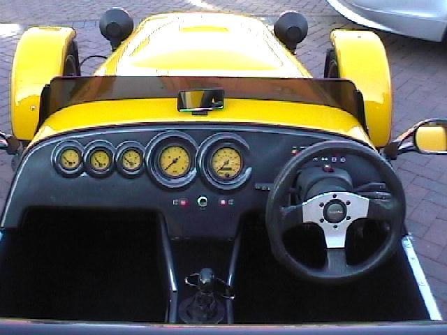
Rescued attachment jvn154.jpg
another

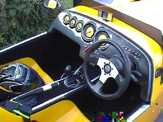
Rescued attachment jvn182.jpg
Number 2 floats my boat 
Like this:
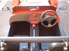
Rescued attachment 1.jpg
Hi nick, nice to see the Gauges made it into the budget, 1 looks good to me Cheers Nige 

6 
Thanks for your feedback chaps!
I've decided on design 1 and tonight's the night (as they say) I'm going to start cutting holes!
Watch this space for progress 
Cheers
Nick
Too late i know but Design 1 is the one i'd go for, however i'm going for this....
[img][/img]
I know I'm too late, but I like 4 ! does this make me weird or something ?
Or something....... 
talking about weird - is it just me that thinks that design 1 reminds them of a Butterflly
In fact whilst I'm at it design 2 looks like the face of a deranged robot and design 5 looks like a pair of slightly odd feet ?
OK - need to lie down now 

4 for me too.
I would prefer the speedo and rev counter above the steering column if there is room (Like a caterham)
No weirdos, just different tastes 
Ideally I would put the speedo and tacho abbove the wheel as well, but there's not enough room for it.
My plan is to cut a large aperture in the plywood dash and make an ally panel to fit behind it. All the instruments and lights will be fitted to the
ally panel. This way they will be recessed and if I decide I don't like the layout I can make a new ally panel rather than a complete
dashboard.
Work starting at 3pm on the dot this afternoon 
how much have you extended the gear lever backwards by?
there's no way i could get a dash that deep and still select 1st, 3rd, and 5th, and that's with the gear lever cut off below the rubber
damper, but in the standard position.
just a thought, but impartant if you've not fitted your lever yet.
i personally prefer design 4, but then that's very similar to my dash (i've got water temp over fuel)
tom
Tom,
I haven't cut the lever down yet, but I have "cranked" it back a good way. I bent back it immediately above the rubber bush, then bent
it up again about half way along the shaft. I can get all the gears OK without banging my hand on the dash. It's not ideal, but it does work
OK.
I plan to fabricate a new lever eventually, but it works for the minute.
Cheers
Nick
To late now (probably)
But #6 is the best