Paradoxia0
|
| posted on 9/4/07 at 09:32 PM |

|
|
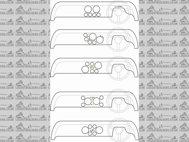
Possible dashobard layouts - opinons anyone?
Hi All
Been busy the last few days sorting odds and sods and generally having fun with my mechano set in the sun!
I got round to making a dashboard that fits quite nicely and decided before starting to cut holes for dials etc I'd have a play on the PC and see
what my options were...
Can you let me know your opinions on them please? I need to add a switch for the radiator fan and fog light but that should be easy enough to add.
Thanks
Mark
 
Description
There is no replacement for displacement...
|
|
|
|
|
RazMan
|
| posted on 9/4/07 at 09:34 PM |

|
|
Bottom one without a doubt 
Cheers,
Raz
When thinking outside the box doesn't work any more, it's time to build a new box
|
|
|
rayward
|
| posted on 9/4/07 at 09:44 PM |

|
|
another variation...
.JPG)
Ray
|
|
|
Avoneer
|
| posted on 9/4/07 at 09:48 PM |

|
|
I like the top one.
Looks the most un-cluttered.
Pat...
No trees were killed in the sending of this message.
However a large number of electrons were terribly inconvenienced.
|
|
|
Avoneer
|
| posted on 9/4/07 at 09:50 PM |

|
|
Mine:.JPG)
No trees were killed in the sending of this message.
However a large number of electrons were terribly inconvenienced.
|
|
|
locoboy
|
| posted on 9/4/07 at 10:01 PM |

|
|
Here's my old one
[img][/img]
ATB
Locoboy
|
|
|
907
|
| posted on 9/4/07 at 10:40 PM |

|
|
Yup. Top one. Simple but effective.
Paul G
|
|
|
speedyxjs
|
| posted on 10/4/07 at 06:07 AM |

|
|
quote:
Originally posted by 907
Yup. Top one. Simple but effective.
I agree but i also think the second one looks very modern. 
How long can i resist the temptation to drop a V8 in?
|
|
|
Marlon
|
| posted on 10/4/07 at 08:24 AM |

|
|
I like the second one too.
john.
Band Anyone?
Linky to SWMBO 's band
Linky to Brother in laws band
MKoc 1081
|
|
|
Catpuss
|
| posted on 10/4/07 at 09:04 AM |

|
|
Yep, top two. The bottom one's indicator lights are too busy.
|
|
|
Hammerhead
|
| posted on 10/4/07 at 09:17 AM |

|
|
top one here too
|
|
|
Gergely
|
| posted on 10/4/07 at 09:20 AM |

|
|
Top one for me, but bottom one not ugly either...
Gergely
|
|
|
iank
|
| posted on 10/4/07 at 09:36 AM |

|
|
Second one for me, but you need to put the switchgear on to decide for sure (IMO)
Might be worth adding the steering wheel exemption area on the CAD while you're at it.
--
Never argue with an idiot. They drag you down to their level, then beat you with experience.
Anonymous
|
|
|
gingerprince
|
| posted on 10/4/07 at 11:08 AM |

|
|
I quite like the second one as something a bit different, however in all cases I think you're better with at least the telltale lights above
your steering wheel in line of sight - you're much more likely to notice an oil warning light quicker if it's line of sight, rather than
the next time you check your speedo.
|
|
|
Bluemoon
|
| posted on 10/4/07 at 12:19 PM |

|
|
Top..
Dan
|
|
|
wilkingj
|
| posted on 10/4/07 at 09:19 PM |

|
|
Friggin 'Eck... Its only a dashboard.
Make it, and if you dont like it make another. They arre not expensive to make, its the gauges that cost the money (if all new)
What you making it out of? Cold Pressed Latinum 
Try some wood and a decent covering, and make several!

PS... My Dash is like the top one.
1. The point of a journey is not to arrive.
2. Never take life seriously. Nobody gets out alive anyway.
Best Regards
Geoff
http://www.v8viento.co.uk
|
|
|
Angel Acevedo
|
| posted on 11/4/07 at 03:43 PM |

|
|
quote:
Originally posted by gingerprince
I quite like the second one as something a bit different, however in all cases I think you're better with at least the telltale lights above
your steering wheel in line of sight - you're much more likely to notice an oil warning light quicker if it's line of sight, rather than
the next time you check your speedo.
Agree on the indicator lights, for me any of the two bottom ones.
Beware of what you wish.. for it may come true....
|
|
|
Steve Lovelock
|
| posted on 12/4/07 at 06:38 AM |

|
|
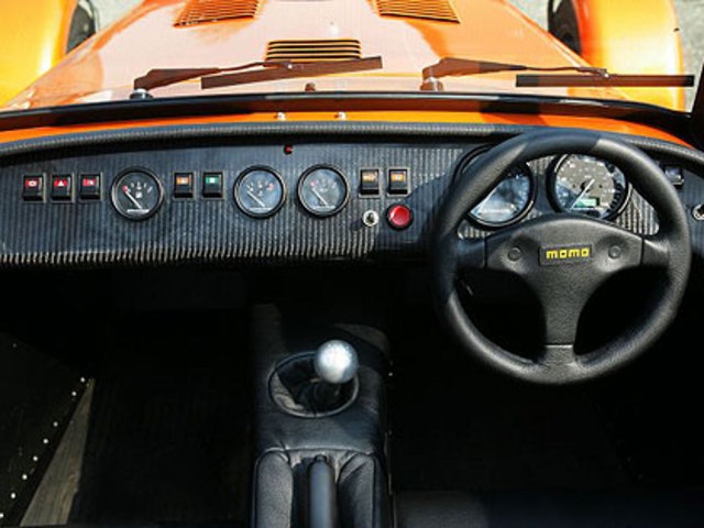
Well, I am going to cheat and copy the Caterham layout because I think it looks really professional:
 
Rescued attachment dashboard2.jpg
|
|
|
Paradoxia0
|
| posted on 18/4/07 at 10:50 PM |

|
|
Thanks for your input one and all.
(sorry I didn't respond before but my subscription to the thread wasnt't working and I thought you were all ignoring me!)
I am currently making the second one to see what it looks like, and I think I agree about the warning lights all being above the wheel. Separated as
they are would make it harder to spot what was what.
Once it is complete I will post up the finished article 
Mark
There is no replacement for displacement...
|
|
|


