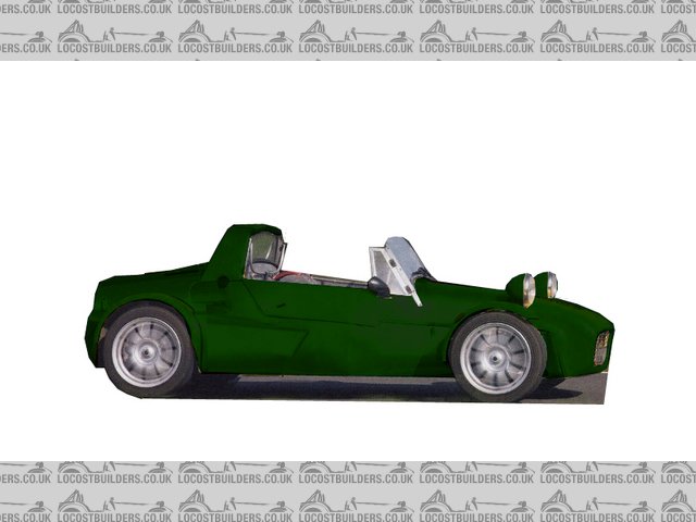
"Interesting" middy from PPC Magazine
TheGecko - 19/1/07 at 09:01 AM
Practical Performance Car doesn't always appear on the shelves here so I've probably only ever bought it once before. The December'06
issue caught my eye though because the cover said "Mid-engined Turbo Se7en - Built from scratch for Ł3K". The car itself is
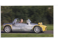
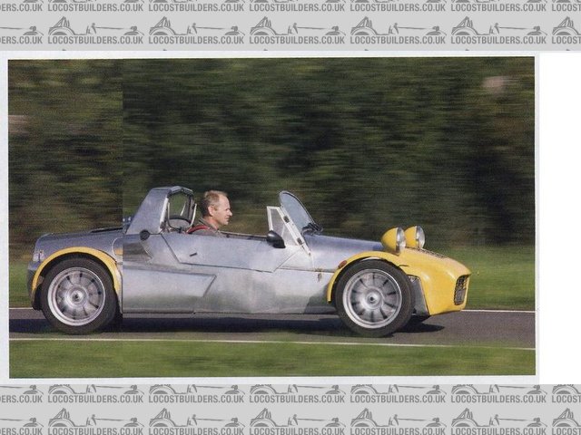
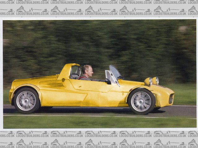
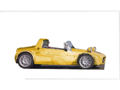
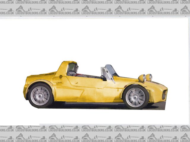
"interesting" and, to me at least, a perfect illustration of why longitudinal mid-engines and clubman body styles do not mix!
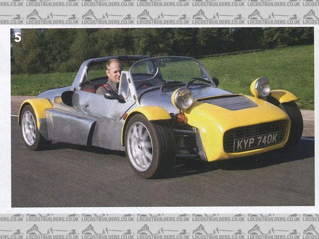
Middy from PPCMAG Dec06 - 1
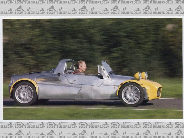
Middy from PPCMAG Dec06 - 2
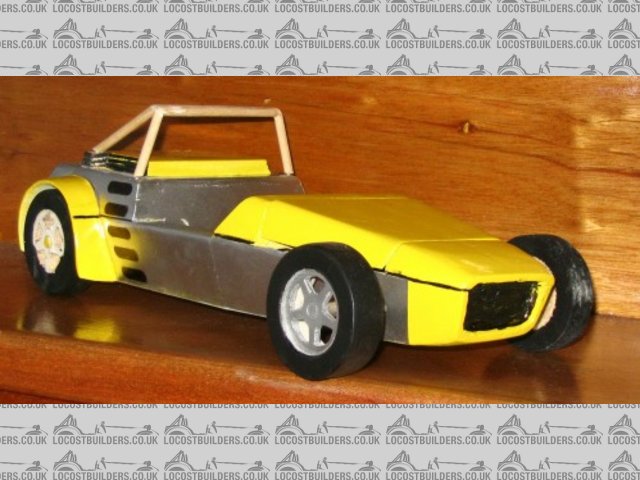
Now I feel vindicated for the amount of time I spent drawing and re-drawing the car and building models to confirm that the proportions worked OK.
Still, at the end of the day, he's on the road and I'm not  so I can't throw stones.
Brief details are:
Renault 21 Turbo engine with UN1 gearbox. Renault 25 front suspension & steering. Square tube spaceframe, hand bent/bashed/folded ali panels.
Caterham nosecone, split and widened.
Dominic
Howlor - 19/1/07 at 09:24 AM
I actually quite like the wide flat front but then not a lot thereafter.
Steve
RazMan - 19/1/07 at 09:28 AM
You have to admire the guy for building it though - it is certainly different. Perhaps if it was painted one colour it would improve a bit....
nitram38 - 19/1/07 at 09:29 AM
Looks very similar to the Sylva R1ot

[Edited on 19/1/2007 by nitram38]
donut - 19/1/07 at 09:30 AM
To be honest as RWD setups become harder to get (except for BMW) this is probably the way forward. Looks good to me!
JonBowden - 19/1/07 at 09:48 AM
actually, I don't think it's too bad.
I like the use of F1 style (sort of) side pods - makes the car a bit more balanced looking,
Howlor - 19/1/07 at 09:54 AM
I presume it takes a hard top, anyone have any pics of the rear?
I certainly agree with Razman that it would look good painted all one colour. I think the windscreen would look better with a flat top rather than the
curve as well.
Steve
iank - 19/1/07 at 09:59 AM
Using a transverse layout would suck around 12" out of the wheelbase and back end, which I think would balance it up a bit.
But as Dominic says he's designed his own car and built it which is more than most of us.
macnab - 19/1/07 at 10:11 AM
Well I just have to disagree with the first comments, I think he’s done a great job of that car. It looks well balanced in it’s proportions and also
well built. Though personally I’d like it with larger diameter wheels.
It would be nice if he could produce chassis plans. Maybe a new candidate for the next locost book series?
[Edited on 19/1/07 by macnab]
JonBowden - 19/1/07 at 10:25 AM
thought I'd try shortening it using Paintbrush to see what a transverse engine would look like - Don't think it looks better


Rescued attachment ppcMid-Short.jpg
02GF74 - 19/1/07 at 10:30 AM
quote:
Originally posted by RazMan
You have to admire the guy for building it though - it is certainly different. Perhaps if it was painted one colour it would improve a bit....
ideally using invisible paint
(but as least his is n the road, unlike mine  )
)
iank - 19/1/07 at 10:31 AM
Thanks for that, must say I think it looks much better but taste is such a personal thing.
JonBowden - 19/1/07 at 10:56 AM
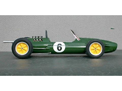
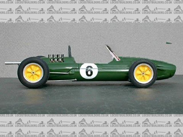
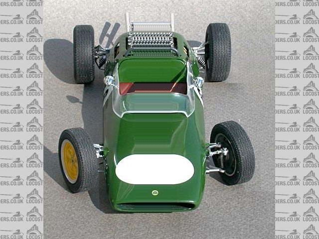
I quite like the idea of copying an old F1 style car. for example this paintbrush modded Lotus 25 (I can take it if you hate it)


Rescued attachment LOTUS2503.jpg
JonBowden - 19/1/07 at 10:56 AM
another view


Rescued attachment LOTUS2517-Wide2.jpg
Hammerhead - 19/1/07 at 11:00 AM
I like your old style F1. Very cool.
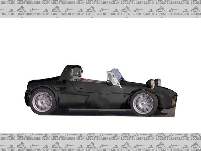
The pic below is said car all one colour.


Rescued attachment mid7.jpg
Hammerhead - 19/1/07 at 11:09 AM
and modded for transverse engine. also lowered the windscreen a bit.
Quite like it, a little like a fiat x1/9?


Rescued attachment mid7mod.jpg
MikeR - 19/1/07 at 11:12 AM
i'd love an old f1 style road going car .... but thats just me 
TheGecko - 19/1/07 at 11:37 AM
Wow,
That kicked off some discussion 
A few points:
- although the styling/proportions doesn't much for me, all credit to the owner for being on the road. According to the article, he did 6,000
miles around Europe in it for his honeymoon (tolerant spouse!).
- I like the "wide mouth frog" nose  although the lights make it a little bit "bug eyed".
- I agree that a single colour helps a little and shortening the tail helps a LOT but that's just my opinion. A reminder of what I'm (very
slowly) building:


Gecko model with silver sides
Dominic
iank - 19/1/07 at 11:54 AM
Just noticed the reg... oh dear it's still on the database as a Renault 16TL 
goodall - 19/1/07 at 11:56 AM
maybe it doesn't look good in yellow, is it simple to change the colour? if so post a few in different colours
i think its alright looking but the long bonnet of the 7 is one of its defining features
Marcus - 19/1/07 at 12:12 PM
I have to say, Hammerheads shortened yellow one has something. I like it!
Hammerhead - 19/1/07 at 12:13 PM
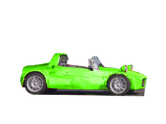
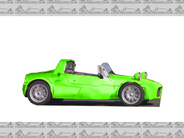
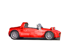
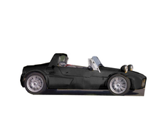
ok here goes - shortened and colour changes (I like the bad ass black best)


Rescued attachment midgreen.jpg
Hammerhead - 19/1/07 at 12:14 PM
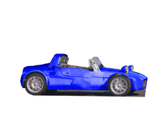
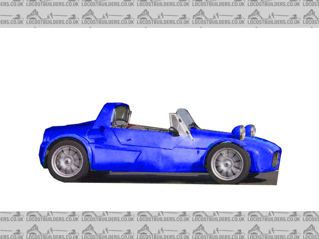
nother


Rescued attachment midblue.jpg
Hammerhead - 19/1/07 at 12:14 PM
red?


Rescued attachment midred.jpg
Hammerhead - 19/1/07 at 12:15 PM
bad ass
ok back to work now.


Rescued attachment midblack.jpg
goodall - 19/1/07 at 12:32 PM
yea has to be black out of those ones alright, if only i could use photoshop then i could do a mock up in BRG for myself, could you do one in BRG are
will that get you the sack? 
i think middy with east-west setup will be the way forward for locost alright
Hammerhead - 19/1/07 at 01:12 PM
brg is quite tricky but i've had a go.


Rescued attachment midbrg.jpg
goodall - 19/1/07 at 01:24 PM
i like it
the only problem with that design is theres too many panels that dont join very well
owelly - 19/1/07 at 01:55 PM
IIRC the bloke built the car and then kept on adding bits until it worked. Hence the side pods and such things. He has also toured the continent in
it. And even went on his honeymoon in it if my memory serves me correct!
Coose - 19/1/07 at 02:12 PM
quote:
Originally posted by donut
To be honest as RWD setups become harder to get (except for BMW) this is probably the way forward. Looks good to me!
No problems there - bike engines and Freelander diffs! 
goodall - 19/1/07 at 03:46 PM
theres still plenty of cars out there with the right bits just price will start to go up more and more as they become more collectable untill the
80's almost every car was rwd, lots of bits to go about dont worry we are a minority us car builders
damien - 19/1/07 at 06:08 PM
i like it, its different in a good way
akumabito - 19/1/07 at 11:46 PM
With just a bit of photoshoping that car could be made to look pretty good I think. It just needs some cleaning up really.. perhaps change the
windscreen a bit... I'll see what I can conjure up... I shall return!
akumabito - 20/1/07 at 12:21 AM
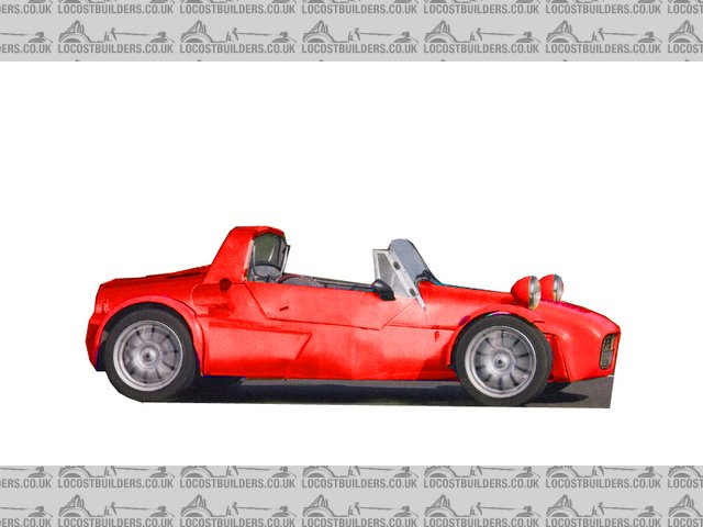
There ya go, it looks better already.. not much cosmetic surgery was needed... I removed a seem in the bodywork, changed the window to a flat-top, and
tilted it back a a bit more and I enlarged the back of the cabin a bit..
"Fixed" version:

Red:

Blue:

Yellow:

BRG:

Silver:

Gold:

Although I usually dispise golden cars, I actually quite like it on this model! 
akumabito - 20/1/07 at 12:31 AM
Could someone please scan the article? I don't think we get that magazine here in the Netherlands (definitely never seen in in the shops...) Does
the guy have his own website with build diary?
TheGecko - 20/1/07 at 05:12 AM
quote:
Originally posted by akumabito
Could someone please scan the article? I don't think we get that magazine here in the Netherlands (definitely never seen in in the shops...) Does
the guy have his own website with build diary?
No mention of a web site or similar. Back issues of the magazine may be available - try their website.
The may be scans of the pages in question at this address 
Dominic
akumabito - 22/1/07 at 08:04 PM
quote:
Originally posted by TheGecko
quote:
Originally posted by akumabito
Could someone please scan the article? I don't think we get that magazine here in the Netherlands (definitely never seen in in the shops...) Does
the guy have his own website with build diary?
No mention of a web site or similar. Back issues of the magazine may be available - try their website.
The may be scans of the pages in question at this address 
Dominic
Sweet 
RallyHarry - 22/1/07 at 10:31 PM
I'm trying really hard, but it doesn't work for me.
Se7en has a bit of class due to the cleaniness, but this is just someone who wanted a middy AND a se7en.
Funny thing is, none asked BHP or 0-60, just "wonder if it looks better in red"
But I do fancy a sixties F1 with a bike V8 ... grrr...
Cheers
rav - 22/1/07 at 11:18 PM
I agree - 60's F1 revisited could be a winner
ceebmoj - 23/1/07 at 08:14 AM
quote:
Originally posted by rav
I agree - 60's F1 revisited could be a winner
There are a couple of that type of thing about I think brooklends to a modem interpretation and tiger defiantly do a single setter
kreb - 24/1/07 at 06:30 AM
My biggest issues are with the ridiculous bugeye lights and the Sevenesque windscreen. The rest of it is decently clean, but those warts plus the very
vertical windscreen - blech!
wilkingj - 25/1/07 at 10:08 AM
Dont you just Love this site... this thread was like Linux for Cars... all hands to the pump, and idea's bouncing about..
I applaud the guys effort, though I dont think its that elegant. Still better than no car at all.

tiagodovale - 28/1/07 at 02:11 AM
(long time reader, so I feel at home  )
)
I think he complicated the design: to much shapes and lines... A better use of colours or materials can help make the proportions work: what to you
think of this?

(or this, respecting the frame: )

Cheers! 
Pseicho - 28/1/07 at 12:59 PM
Nice Smart Roadster! 
Seriously though, with other front lights it would look really good
tiagodovale - 28/1/07 at 02:33 PM
hehehe 
I noticed that he placed the engine longitudinaly in an extended rear but kept the long sevenesque nose.
By giving it a logic dimension to that setup, I think it makes a difference!
(sorry for using and changing your images, guys)

[Edited on 28/1/07 by tiagodovale]
akumabito - 28/1/07 at 03:29 PM
I don't like the shortened versions at all. The original design is still best, though it definitely needs a proper paintjob, and some new
headlights. 


 so I can't throw stones.

