My new Mid-Five project
xico_ze54 - 5/5/06 at 09:10 PM
Hi everybody,
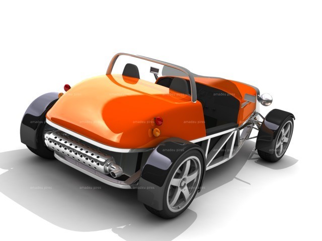
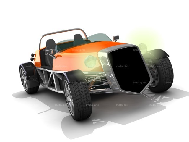
Here I am to show you an antevision of my future Project. Don’t make particular attention to details, structures, proportions and so on, because this
is only a draft.
This will be a mid-engined car, with a recent drivetrain and the main point is that the bodywork consistes in only three elements: a strong grill
plenty of character and front and rear bonnets.
Please take a look and if you want see more about that, go to the site: http://www.viseudesign.com/mid-five.htm
Cheers
Amadeu Pires
[Edited on 5/5/06 by xico_ze54]
[Edited on 5/5/06 by xico_ze54]


Rescued attachment midFive_3-vga75.jpg
dave1888 - 5/5/06 at 09:13 PM
Looks quite smart
xico_ze54 - 5/5/06 at 09:13 PM
quote:
Originally posted by xico_ze54
Hi everybody,
Here I am to show you an antevision of my future Project. Don’t make particular attention to details, structures, proportions and so on, because this
is only a draft.
This will be a mid-engined car, with a recent drivetrain and the main point is that the bodywork consistes in only three elements: a strong grill
plenty of character and front and rear bonnets.
Please take a look and if you want see more about that, go to the site: http://www.viseudesign.com/mid-five.htm
Cheers
Amadeu Pires
[Edited on 5/5/06 by xico_ze54]
[Edited on 5/5/06 by xico_ze54]


Rescued attachment midFive_5-vga75.jpg
olv - 6/5/06 at 12:24 AM
the back looks great, i'm not a fan of the front though
RazMan - 6/5/06 at 08:08 AM
I have to agree about the front - a little too retro for my taste. It reminds me of the 1950's Bugatti.
Love the back end though - a nice fusion of styles 
Messenjah - 6/5/06 at 12:30 PM
love the frront but the front and back dont match style wise looks a bit like a cut and shut
other then that its g00000000d
cymtriks - 6/5/06 at 05:53 PM
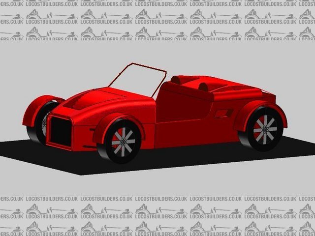
This is a picture of my own middy 7 design.


Rescued attachment snapshot2.jpeg
russbost - 7/5/06 at 10:18 PM
Xico's car reminds me of the Edge Devil at the rear end, perhaps a more modern front end would suit, particularly as there's something
similar to the Atom in there too....................
tigris - 9/5/06 at 12:11 AM
Is this solidworks or rhino? Any info on where to get started with this type of modeling.
The design is very inspring, reminds me of a retro-modern '32 ford roadster, and considering that the early fords embody an across the pond
predecessor/similarity of the 7 (high speed, lo-cost, lightweight) I think its top notch.
Good work
kreb - 9/5/06 at 01:41 PM
While it's stylish on the screen, I think that you'll want to tone down the grille/frontal area. It's unnecesary and out of
proportion. Where will all that air go? out the bottom? It also looks like a very long hoodline for a middie (hard to tell with no side views), Whats
the wheelbase?
Show us more!
Marcus - 9/5/06 at 02:19 PM
Got to agree, back looks stunning, front poss a little too high, grille does it no favours.
Marcus
russbost - 9/5/06 at 09:19 PM
quote:
It also looks like a very long hoodline for a middie (hard to tell with no side views), Whats the wheelbase?
It's not as long as mine (as the actress said to the bishop) are you saying this makes F1 cars out of proportion?
trogdor - 24/5/06 at 05:25 PM
i really like it! both the front and back, and thats just not cause i really like orange. i agree witht the previous about looking like a more modern
1930's ford.
would love to know more details, engine, trans etc.
[Edited on 24/5/06 by trogdor]

