Opinions wanted
Alan B - 16/11/02 at 08:44 PM
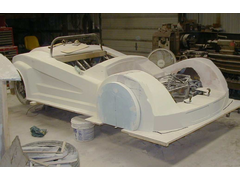
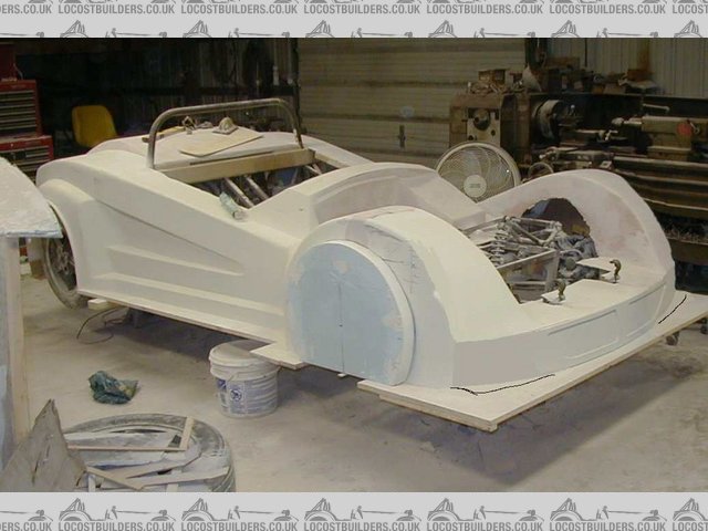
Guys, I will be making moulds soon and could use some feedback on the front arch positioning. I have the styrofoam plug piece which will form the
mould flanges for the returns shown in position.
IMO it looks a bit too "front heavy"

Am I over-reacting, does look it OK, or should I do something? I could possibly move the front wheels forward about 1" with some chassis work. It
would then look like:....

Better I think, but is it worth the effort?
The bulk in front of the wheel is necessary to fit headlights at the legal height. Another option is some sort of grille feature just ahead of the
wheel to break it up a liittle.
Any thoughts appreciated. Thanks.
theconrodkid - 16/11/02 at 10:29 PM
yup it does look a bit "heavy"on top and in front of the wheels,can you not trim it down a tad?
Alan B - 16/11/02 at 10:38 PM
Conrod, thanks. The feedback is appreciated. The top of the styrofoam represents 24" above the ground which is around legal light height (I
think?).
So, yes some trimming is possible, and I'll do it...just have to convince myself I can make enough improvement to justify the effort.
This next picture shows a more normal viewing height. I don't think it looks as bad especially if you can imagine the bonnet on too.....or am I
kidding myself? 

ProjectSRP - 17/11/02 at 12:00 AM
I agree with Conrod, a little bit heavy up top. Maybe if you rounded the front edge a little bit more it would make it seem a little less obvious. I
think the sharp edge makes it really stand out. Just an idea.
TheGecko - 17/11/02 at 01:23 AM
Alan,
It does look very heavy as it stands. I don't think moving the wheel opening forward 1" makes much difference either. As you say, perhaps some sort
of grille to break up the bulk may help.
I had the same problem at the front of my design which is why I chopped about 150mm off the nose and resigned myself to engineering some sort of
pop-up lights to ge legal height. BTW, is 24" definitely the min height for NA? Our regs just copy the Euro spec and say minimum 500mm or 20". That
4" difference could mean a lot.
Dominic
Alan B - 17/11/02 at 03:21 AM
Hi Dominc,
Thanks for the feedback.
I think the height here is actually 22", and I just tried one of my lights earlier. It seems I could probably chop about 2" out of the centre of the
arch and effectively shorten the whole car.
As it is now it doesn't offend my eye greatly just more of a niggle that everyone is confirming. I'll probably leave it for a week or so and think
about it.
It certainley seems that the concensus is that some reduced bulk ahead of the wheel or something to that effect would be an improvement.
I know it definitely looks better with the bonnet on, but I'm almost certainly going to reduce the bulk.
Everyone, thanks for the input, and sorry for rambling
theconrodkid - 17/11/02 at 07:48 AM
if you could continue yhe radius from the back of the wheel towards the front a bit more then maybee build a box for the lights to go in,saw some on a
ford puma,spot light type they cant have too much behind them,its getting there
TheGecko - 17/11/02 at 09:29 AM
quote:
Originally posted by Alan B
I know it definitely looks better with the bonnet on, but I'm almost certainly going to reduce the bulk.
Alan,
Have had a little more of a thing about it and came up with a possible solution. Have you seen the Suzuki C2 show car from a few years ago? Here's a
link to an image Suzuki C2. What I find particularly of interest is the enclosed Perspex
covered front lights. I suspect something similar could reduce the visual bulk of your front arches. Here's a (badly) modified image to illustrate
what I mean.

I also added two little 'gill' vents at the bottom.
Dominic
Alan B - 17/11/02 at 12:53 PM
Guys, again thanks for input.
Conrod, I don't know if you saw another thread, but I found some fairly shallow lights, some 90mm Hella units which look nice. Agree with you and Paul
that more radius will help.
Dominic, I can see that helps a lot. It definitely reduces the visual bulk. I tried it with a double set of gills, like you have done but with the
same again mirrored above them. The wrap around perspex (Lexan, US) is also a good idea, but I'll have to research the forming of it.......any links
anyone?
interestedparty - 17/11/02 at 01:45 PM
quote:
Originally posted by Alan B
. The wrap around perspex (Lexan, US) is also a good idea, but I'll have to research the forming of it.......any links anyone?
Alan, I'm pretty sure that Lexan is a trade name for polycarbonate, what you need is Plexiglass, the US name for Perspex (acrylic).
I presume it's possible to vacuum heat form polycarbonate, and you would cetainly get a strong result as it's used for riot shields. (good idea if
Meerkats are to be used by police forces for riot control)
John
Alan B - 17/11/02 at 01:56 PM
John, you are correct, thanks.
In summary:-
Acrylic = Perspex, Plexiglass = very,very clear, fairly hard, a bit brittle, cheap
Polycarbonate = Lexan, Hyzod, Tuffak = very clear, very tough, not as hard, not quite as cheap
Yes, both can be vacuum heat formed.
BTW, I didn't know this 1 hour ago 
Isn't the internet good eh?
Alan B - 18/11/02 at 12:20 AM
Guys, I took 3" out of the arch in the centre. 


For those not so squeamish the gory details are at:
http://www.desicodesign.com/meerkat/Bodywork.htm#bottom
Thanks for the feedback. Being unanimous helped a lot 

Spyderman - 18/11/02 at 01:04 AM
No Don't do it. It looks fine!
Just kidding!
Have you decided what kind of paint finish you are going for?
As Visual imbalances can be used/hidden with careful use of colour.
Just a thought as some cars do not look balanced when in one colour, but look fine in another, or even two tone.
Terry
Geoff011 - 18/11/02 at 01:27 AM
Alan,
Would like to see a pic taken from the same angle as that used at the beginning of this thread.
I see you have chopped 3 " out of the front. I did a rough image edit on your initial pic to remove some of the bulk forward of the wheel centreline
and adding a little bulk rear of the wheel centreline and softening the radius on the transition between the top of the arch and the side.
I think you'd still be able to squeeze in your lights?Image deleted by owner
Geoff011 - 18/11/02 at 01:30 AM
Alan,
Forgot to say how much I like the front after your 3" chop!
Geoff.
Alan B - 18/11/02 at 01:47 AM
Same viewpoint....cut back 3"....prior to blending etc.....just got room for the lights....
Terry....Red (I think!)

TheGecko - 18/11/02 at 12:52 PM
Alan,
Now that you've chopped & sectioned the body I'll throw in another suggestion 
You may be able gain a bit more space by letting the headlight protrude a little from the front of the panel. Here's a photo (from the
Pagani Zonda web site) that shows what I mean.

Hope this is helpful and not too little too late 
Dominic
Alan B - 18/11/02 at 01:06 PM
Dominic,
The Zonda picture isn't showing for me, but I know exactly what you mean, with the lights partially protruding.
I'm farily certain I still have enough room to recess the lights completely, but the Zonda idea is still an option.
Cheers, Alan.
Spyderman - 18/11/02 at 02:37 PM
Alan,
I think if the front profile (across front grill) was radiused a bit more, it would round off the wheel arches in the front area. I tried modifying a
picture to show what I mean, but it l'm not that good at the drawing. It would make top plane slope outwards down past headlight area to bottom.
Also putting more of a radius on outer edge of arch might help some.
Probably would need to be tested out graphically before any cutting was done.
Just my thoughts, anyway.
Terry

Alan B - 18/11/02 at 03:02 PM
Terry,
I'm not sure what you mean with the first part. Do you mean the leading edge that runs horizontally side to side? or the vertical edges on the front
corners?
More radius on the edge has been mentioned and considered. My only concern there is with reducing light space, but I will probably end up doing some
radius increase.
Cheers,
Alan
Spyderman - 19/11/02 at 02:12 PM
This is what I was thinking with the front end. Excuse the crudity of it.
Basically the front valence area will curve back more towards the edges of wings. This will make outside edge of wing slope down toward outer edge as
it passes in front of headlight.
It would be easier to explain if there were refernce points on body to refer to (I might have a go at that later).
Do you have a cad image I could manipulate?
Lines on front baseboard show where original body came to.
Terry


Rescued attachment 111702_mod08th.jpg
Alan B - 19/11/02 at 02:45 PM
Terry, that's not so crude...I can see easily what you mean now.
It is certainly another thing to consider.
Obviously, I can't incorporate every suggestion, from everyone, for various reasons but they are all taken on board very seriously and I appreciate
everyone taking the time to offer opinions and suggestions.
Cheers again everyone


Spyderman - 19/11/02 at 02:54 PM
Problem is it just moves the bulk from side profile to front quarter profile!
Might be easier hidden with headlights tho'.
Regards radiusing the wing. I would have thought using the same radius as is on rear arches.
Terry
You never really solve a problem, you just move it to somewhere else!

[Edited on 19/11/02 by Bull]
Alan B - 19/11/02 at 03:59 PM
Terry,
You are certainly right about moving problems....there is not much you do that has no effect on other stuff

The radius at the rear is the same (or will be) as the front, except for the last 12" or so of the rear were it actually increases. Something similar
may be possible at the front...I'm not sure yet....
It is difficult to see some of the sublteties (sp) from just pictures...I appreciate the difficulties of not seeing it the flesh...also as you said
colour makes a difference....I suspect the white is making it harder to judge...
I'm REALLY looking forward to everyone else being at this stage....He He...

Spyderman - 19/11/02 at 04:09 PM
Not a problem for me!
Body is ready and waiting on running gear/chassis etc.
Cowards way out maybe, but I certainly did not fancy doing the compound curves necessary to replicate it's period styling! 

Terry
MrFluffy - 19/11/02 at 04:12 PM
Im with terry on this one since I dont have the entire rest of my life to finish this project (in amongst the zillion others on the go), although Im
going to do some serious remodelling of the sideskirts and stuff..
Now if I could just find a *@#$ windscreen for it......
Spyderman - 19/11/02 at 04:41 PM
Get in touch with Keith Stringer. He runs/helps run club nova. If he can't find one for sale I doubt anyone will unless you're lucky.
http://www.nova-international.net/home.htm
It might be worthwhile buying an abandoned kit to get the screen from. I've seen body shells going for less than screens.
Terry
Alan B - 19/11/02 at 05:23 PM
Well OK....except you two

ProjectSRP - 19/11/02 at 05:32 PM
Don't worry I've allocated a year of my life to building the moulds. Can't say I am looking forward to it. I have helped with a canoe and some boat
hulls in the past but a car is going to be a lot more tricky. I plan on getting the car running and track tested with the undertray fitted before I
commit to the mould production. Hopefully if all goes well I will be at that stage by the start of next winter.
Alan B - 19/11/02 at 07:44 PM
Reminds me of the old Spike Milligan joke.
"flying is safe, crashing is dangerous!"
Similarly, making moulds is quick and easy (relatively)....it's the plugs that are hard work....
Of course I knew what you meant..the whole plug/mould process.......still by the time you are at that stage you'll have a whole catalog of do's,
dont's, oop's, and oh crap's to learn from....

It helps having done it before..I already knew what a dire, thankless task it was...
Good luck


