Redesign my bodywork!
russbost - 16/12/11 at 07:39 AM
Now come on chaps, it's not every day you get to redesign a car! Ok slight exagerration, actually I'm just redesigning the sidepods &
the top of the cockpit sides, one to make it more modern looking, more current F1 shape & two so the sidepod & top of the cockpit side can be
made in one piece, which makes assembly simpler & quicker & saves cost of 2 mouldings over one.
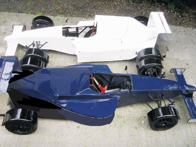
So, this is the current shape
[img]

Latest build
[/img]
This is what's been done so far, as you can see we've brought the height & width up slightly at the front & given it a more rounded
shape. Now I don't quite like it as it is & have my own ideas as to where it should go from here, however, I'm no stylist (go on, you
already know that  ), & don't want to put pre conceived ideas into anyones head, I'd rather have some opinion on what you think would
improve it from here.

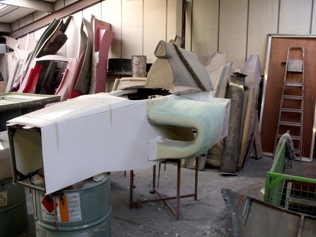
new sidepods1

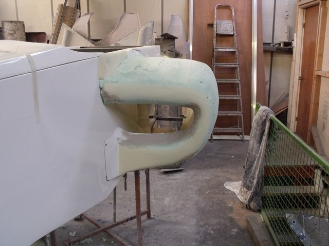
new sidepod 2
There are a couple of constraints, there is a fuel filler aperture which is clearly visible on the first pic, & is marked on the second, tho'
barely visible, not absolutely essential it stays right there, but simpler if it can, it could be raised on a boss if required, or equally well sunk,
"Frenched" into a recess. Also the width needs to be maintained at the rear or there's nowhere for the rad to go & the shape of
about the last couple of inches at the rear needs to be maintained as otherwise it would mean a total redesign of the whole back end, including
chassis &, if any narrower would pretty much preclude fitting car engines of any type other than inline, which would lose the rear passenger
position, don't want to lose either of the above options, so that last section has to stay, tho' can be reshaped so long as it can be
blended into the last couple of inches.
Absolutely any intelligent comments or criticism (constructive please!) are welcome.
Oh! & a merry Xmas to one & all!!!
[Edited on 16/12/11 by russbost]
franky - 16/12/11 at 09:10 AM
Could you not make the front thinner where your feet go or just pass, it always looks like the wishbones are too short.
This would help freshen up the front making it look less 'boxy'. All IMO.
russbost - 16/12/11 at 09:22 AM
There are compromises throughout the design!
Unfortunately F1 cars are driven by relatively small, slim people (current crop of drivers I think Mark Webber & JB are about the biggest at
around 6', but I doubt either of them weigh much over 12 or 13 stone) - if you make the front narrower, you can't get 3 pedals in there
(current F1 only have 2) & I think you'd also run into IVA issues where the pedals would be too close & therefore dangerous. I don't
think you'll find any current F1 drivers with size 12+ feet & I have to be able to fit real people into the car, not just people my
size!
Incidentally bottom wishbones actually couldn't be any longer as they are carried on a central "keel".
edited to say, it is particularly the sidepod mods I'd like feedback on if poss.
[Edited on 16/12/11 by russbost]
Peteff - 16/12/11 at 09:55 AM
The side pods look too thick on the top front edges like they've been made out of square section and rounded off. They need thinner front edges
and more taper into the duct even if it is only cosmetic.
franky - 16/12/11 at 10:09 AM
quote:
Originally posted by russbost
There are compromises throughout the design!
Unfortunately F1 cars are driven by relatively small, slim people (current crop of drivers I think Mark Webber & JB are about the biggest at
around 6', but I doubt either of them weigh much over 12 or 13 stone) - if you make the front narrower, you can't get 3 pedals in there
(current F1 only have 2) & I think you'd also run into IVA issues where the pedals would be too close & therefore dangerous. I don't
think you'll find any current F1 drivers with size 12+ feet & I have to be able to fit real people into the car, not just people my
size!
Incidentally bottom wishbones actually couldn't be any longer as they are carried on a central "keel".
edited to say, it is particularly the sidepod mods I'd like feedback on if poss.
[Edited on 16/12/11 by russbost]
I'm not being negative at all about your car by the way
Maybe just making things look smaller by having sharper edges.
russbost - 16/12/11 at 10:56 AM
"I'm not being negative at all about your car by the way "
No probs - didn't take it that way
Chippy - 16/12/11 at 11:05 AM
In the picture of the completed car, the side pods look right, nice and slim. In the second and third pictures they look absolutely horrid, and do
nothing for the design at all. I am definately no car designer and so wouldn't suggest any type of alteration, but, feel that staying with the
original consept it just looks so much more F1 than the other two. IMHO Ray
Davegtst - 16/12/11 at 11:21 AM
Can you drop the level of the engine cover so the intake vent is just above the headrest and slope it down towards the back a bit more. At the minute
it looks way too big imo. Also would it be possible to slope the nose alot more instead of it being fairly flat.
russbost - 16/12/11 at 11:32 AM
"In the picture of the completed car, the side pods look right, nice and slim. In the second and third pictures they look absolutely horrid, and
do nothing for the design at all. I am definately no car designer and so wouldn't suggest any type of alteration, but, feel that staying with the
original consept it just looks so much more F1 than the other two. IMHO Ray "
Ok, this is weird, when I've had criticisms of the bodywork, it's always that it has been too "slabsided" & it "needs
more curves", hence why we are looking at modding the sidepods to a more current shape (the originals were done looking at cars of 1999 /2000
which were quite flat sided & boxy), the idea with new pods as well was that the old would still be available, these would be an alternative
russbost - 16/12/11 at 11:49 AM
"Can you drop the level of the engine cover so the intake vent is just above the headrest and slope it down towards the back a bit more. At the
minute it looks way too big imo. Also would it be possible to slope the nose alot more instead of it being fairly flat."
The height of the engine cover is another compromise, if you want a decent size engine in it (we run ZZR1400) they are quite tall & by the time
you've got an airbox on it can't be shortened significantly, we try to leave a bit of room in there so people have other options. Again real
F1 run low angle V engines inline & don't accomodate a passenger!
Re the nose, we lifted it & made it flatter to be more like current F1, we still have the low nose available as shown in my avatar pic, but the
latest noses are even higher & virtually dead flat
alister667 - 16/12/11 at 12:08 PM
I prefer the rounded curvier look of the new pods, but I agree with Pete, the top lip looks a little thick.
Is it possible to make the side pods curve up at the top, and down at the bottom to meet the top & bottom rails of the monocoque?
Excellent work.
Fred W B - 16/12/11 at 12:30 PM
I also by far prefer the side pod entries on the current car. The new is rounded at the front but changes back to square at the back, which
doesn't match.
Cheers
Fred W B
[Edited on 16/12/11 by Fred W B]
PSpirine - 16/12/11 at 01:00 PM
I love the current look (hate the curvy pods, sorry) - it's got a very distinctive and clean look about it, rather than appearing to try to look
like a slightly bloated F1 car.
I'd stick with it, and if possible slim down some of the sections edges to make it look even sharper. With the right graphics i think the boxy
look will be far better than any work you do to curve some parts of it whilst still retaining the boxy/fat nose (which as you say isn't going
anywhere due to packaging)
steve m - 16/12/11 at 01:00 PM
I am with Chippy on this one.
as pic one looks as much as an F1 car you can possibly get on the road
pic 2 + 3 do not look right (imho)
Steve
scootz - 16/12/11 at 01:02 PM
I've previously thought that the car was a little too slab-sided, but it didn't have anything to do with the side-pods really... more the
'sharpness' of the angle between the vertical and horizontal faces of the front end. Could you make these angles softer?
The only other thing (as others have already said) is the height of the engine cover. Is there an alternative engine you could use that would bring
that height down? I think the looks often sell a car like this before the engine-package.
russbost - 16/12/11 at 02:25 PM
Funnily enough I felt the new pods were far too fat at the top, this was the bit I didn't want to say at the start as didn't want to
"lead" people.
would something like this (excuse my awful drawing, I'm not good at pc graphics stuff!) look better, I'm particularly keen to get more of a
cutaway towards the bottom of the pod - the area which I've simply removed from this pic - in reality you would still see the rear part of this
cutaway from the front, but I have no idea how to draw that in any representative manner!
[img]

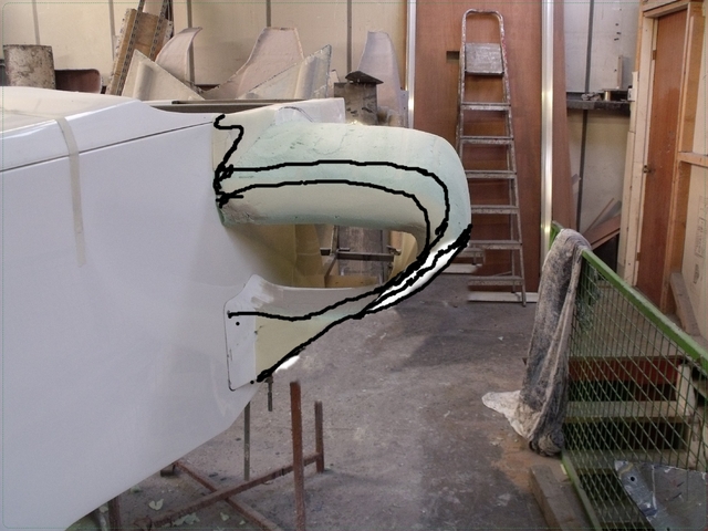
amanded sidepod
[/img]
matt_gsxr - 16/12/11 at 05:01 PM
My personal view is that the modern F1 sidepod is far too fussy, what with the additional barge boards and clever winglets.
I like the general shape but even if you could design one side the second side would be a nightmare.
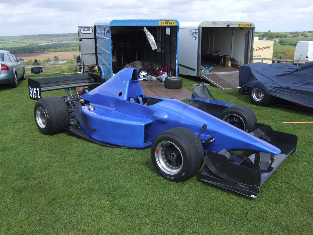
So, what about giving is some curve but retaining a rectangular inlet. By this I mean like this hillclimb car.

russbost - 17/12/11 at 12:34 PM
"My personal view is that the modern F1 sidepod is far too fussy, what with the additional barge boards and clever winglets.
I like the general shape but even if you could design one side the second side would be a nightmare. "
I hear what you say, I just want to bring the car a little more up to date with modern F1 looks, but defo not going to be adding dozens of little
winglets everywhere, now that would be a nightmare.
Re the second side, once we've sorted the shape, we'll just make templates for every few inches & transfer from one side to
t'other, then join the dots, shouldn't be too bad.
JC - 17/12/11 at 11:30 PM
Russ,
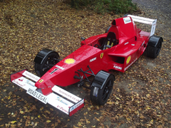
I like the curved design and agree with the comments about the upper edge being a bit thick! How about something like this, inspired by the 2009
Ferrari - making the pods slightly wider and then curving back in, with the rear painted black to reduce its visual impact?
[img]


Furore
[/img]
big-vee-twin - 18/12/11 at 09:41 AM
Think you should stick with rectangular entrances to the side pods, curve them back towards engine like the hill climber.
But for me its from where the driver sits and forward that needs attention. perhaps making the top of the nose curved convex or concave, maybe slight
scooping to the sides and where the step is underneath make this more of a curved transition too
 Ok slight exagerration, actually I'm just redesigning the sidepods &
the top of the cockpit sides, one to make it more modern looking, more current F1 shape & two so the sidepod & top of the cockpit side can be
made in one piece, which makes assembly simpler & quicker & saves cost of 2 mouldings over one.
  ), & don't want to put pre conceived ideas into anyones head, I'd rather have some opinion on what you think would
improve it from here.


