balidey
|
| posted on 13/4/10 at 02:35 PM |

|
|
Not criticising but
New logo looks great, but there was something bugging me about it.
Its a 2D side view, with perspective.
Two seats, one infront of the other, two headlamps, two roll bar stays.
So 10 seconds with good old MS Paint...
 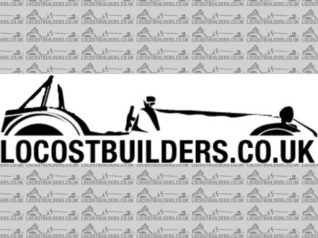
logo slight edit
And I'll repeat, its NOT a criticism on the original, just pointing out something that didn't look right to me.
Dutch bears have terrible skin due to their clogged paws
|
|
|
|
|
eddie99
|
| posted on 13/4/10 at 02:37 PM |

|
|
Glad i wasn't the only one to spot that  Bugged me a bit, or what about turning the car around slightly to make it 3d? Bugged me a bit, or what about turning the car around slightly to make it 3d?
http://www.elitemotorsporteng.co.uk/
Twitter: @Elitemotoreng
Facebook: http://www.facebook.com/pages/Elite-Motorsport-Engineering/153409081394323
|
NOTE:This user is registered as a LocostBuilders trader and may offer commercial services to other users
|
boggle
|
| posted on 13/4/10 at 02:39 PM |

|
|
i think it needs flames
just because you are a character, doesnt mean you have character....
for all your bespoke parts, ali welding, waterjet, laser, folding, turning, milling, composite work, spraying, anodising and cad drawing....
u2u me for details
|
PLEASE NOTE: This user is a trader who has not signed up for the LocostBuilders registration scheme. If this post is advertising a commercial product or service, please report it by clicking here.
|
Doofus
|
| posted on 13/4/10 at 02:41 PM |

|
|
It's a Caterham too.
Thought this was Locost builders...
|
|
|
balidey
|
| posted on 13/4/10 at 02:43 PM |

|
|
quote:
Originally posted by boggle
i think it needs flames
 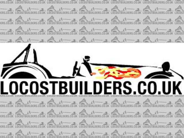
Description
Can you tell its a slow day at work today?
[Edited on 13/4/10 by balidey]
Dutch bears have terrible skin due to their clogged paws
|
|
|
BenB
|
| posted on 13/4/10 at 02:43 PM |

|
|
I agree- I think the single side on view looks better than the shadow lights + seat effect.
|
|
|
A1
|
| posted on 13/4/10 at 02:46 PM |

|
|
i like the flames! 
|
|
|
snakebelly
|
| posted on 13/4/10 at 02:50 PM |

|
|
i like your version better also, not sure about the flames though...
|
|
|
Daddylonglegs
|
| posted on 13/4/10 at 02:51 PM |

|
|
3D 
or not 
Don't mind really.....still better than the old one 
It looks like the Midget is winning at the moment......
|
|
|
balidey
|
| posted on 13/4/10 at 02:56 PM |

|
|
And who puts their rear view mirror INFRONT of their aeroscreen?
Dutch bears have terrible skin due to their clogged paws
|
|
|
locostbuyer83
|
| posted on 13/4/10 at 02:59 PM |

|
|
quote:
Originally posted by snakebelly
i like your version better also, not sure about the flames though...
agreed, nice attempt in mspaint guys
|
|
|
graememk
|
| posted on 13/4/10 at 03:03 PM |

|
|
quote:
Originally posted by balidey
And who puts their rear view mirror INFRONT of their aeroscreen?
Caterham......
|
|
|
boggle
|
| posted on 13/4/10 at 03:03 PM |

|
|
quote:
Originally posted by balidey
quote:
Originally posted by boggle
i think it needs flames
 
Description
Can you tell its a slow day at work today?
[Edited on 13/4/10 by balidey]
hehe
it looks like he has a slight carb backfire isue
just because you are a character, doesnt mean you have character....
for all your bespoke parts, ali welding, waterjet, laser, folding, turning, milling, composite work, spraying, anodising and cad drawing....
u2u me for details
|
PLEASE NOTE: This user is a trader who has not signed up for the LocostBuilders registration scheme. If this post is advertising a commercial product or service, please report it by clicking here.
|
skinned knuckles
|
| posted on 13/4/10 at 03:21 PM |

|
|
actually, i like the current one just fine. if you stood side on to a 7, that is what you would see. similar to standing at the top of a tree lined
avenue and looking down. you dont just see one tree on either side, you see all the trees that run the length of said avenue. i believe its called
perspective? if you wanted a view of a 7 sliced in half your modified one would be right.
i say keep it as it is, nice work whoever designed it
A man isn't complete until he's married, then he's finished
|
|
|
ChrisW
|
| posted on 13/4/10 at 03:25 PM |

|
|
quote:
Originally posted by skinned knuckles
....nice work whoever designed it
See here: http://www.locostbuilders.co.uk/viewthread.php?tid=133987
Chris
|
|
|
kipper
|
| posted on 13/4/10 at 04:02 PM |

|
|
new logo
will there be stickers? They would be handy for Identifying members at shows and such,  . .
Denis.
Where did that go?
<<<<
|
|
|
sucksqueezebangblow
|
| posted on 13/4/10 at 04:06 PM |

|
|
quote:
Originally posted by balidey
New logo looks great, but there was something bugging me about it.
Its a 2D side view, with perspective.
Two seats, one infront of the other, two headlamps, two roll bar stays.
So 10 seconds with good old MS Paint...
 
logo slight edit
And I'll repeat, its NOT a criticism on the original, just pointing out something that didn't look right to me.
Wow, your eyes must be a long way apart to get a flat perspective like that. When I stand that close to the side of a locost, I can see both seats and
both headlights! Must have my eyes too close together 
Better to Burnout than to Fade Away JET METAL ~ AndySparrow © 
|
|
|
eddie99
|
| posted on 13/4/10 at 04:10 PM |

|
|
The point is, if you saw 2 headlights or 2 seats. Then you would also see a bit of the nosecone or rear panel etc.. In that pic. its a mix between
both
http://www.elitemotorsporteng.co.uk/
Twitter: @Elitemotoreng
Facebook: http://www.facebook.com/pages/Elite-Motorsport-Engineering/153409081394323
|
NOTE:This user is registered as a LocostBuilders trader and may offer commercial services to other users
|
SeaBass
|
| posted on 13/4/10 at 04:16 PM |

|
|
The logo is basically this image:
http://www.seriouswheels.com/pics-2008/bc/2008-Caterham-Seven-Superlight-R500-Side-1280x960.jpg
Modified into a two tone logo. It's therefore a Caterham.
Not sure who did the Photoshop though.
|
|
|
Staple balls
|
| posted on 13/4/10 at 04:17 PM |

|
|
I was wondering why it didn't look right (apart from being a catering van) 
Glad someone pointed it out, so I don't have to think about it.
|
|
|
SPYDER
|
| posted on 13/4/10 at 04:38 PM |

|
|
I hope Caterham aren't reading this. They'll be on to their copyright solicitors before you can say Ron Champion!
|
|
|
ChrisW
|
| posted on 13/4/10 at 04:43 PM |

|
|
quote:
Originally posted by SPYDER
I hope Caterham aren't reading this. They'll be on to their copyright solicitors before you can say Ron Champion!
My comments on this are in this thread:
http://www.locostbuilders.co.uk/viewthread.php?tid=133965&page=2
Now, please, let this be the last of this.
Chris
|
|
|
wicket
|
| posted on 13/4/10 at 04:48 PM |

|
|
Splitting hairs here a little aren't we. I think it looks great as it is. It is a logo after all, not mean't to be a photographic image.
|
|
|
richardh
|
| posted on 13/4/10 at 06:14 PM |

|
|
it would IMHO if the farthest front light was nearer the fornt of the car than the nearest one - to match the seat and roll bar
Either way its better than the last one, much more up to date
Time for a change!
|
|
|
Wadders
|
| posted on 13/4/10 at 07:38 PM |

|
|
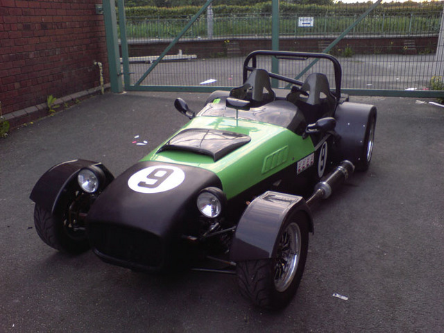
Yeah, can't imagine anyone would be that daft! 
Description
Originally posted by balidey
And who puts their rear view mirror INFRONT of their aeroscreen?
|
|
|


